Browsing Tag

styling

Spaces

MICHELA BERTOLINI

12th January 2017

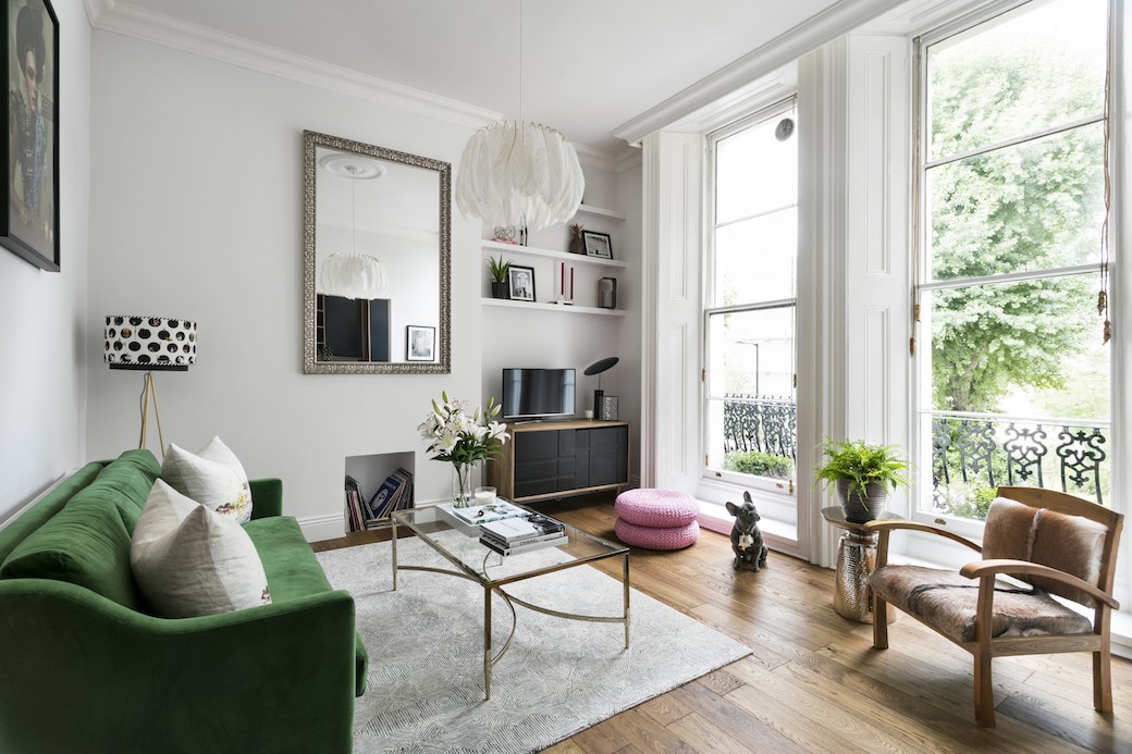
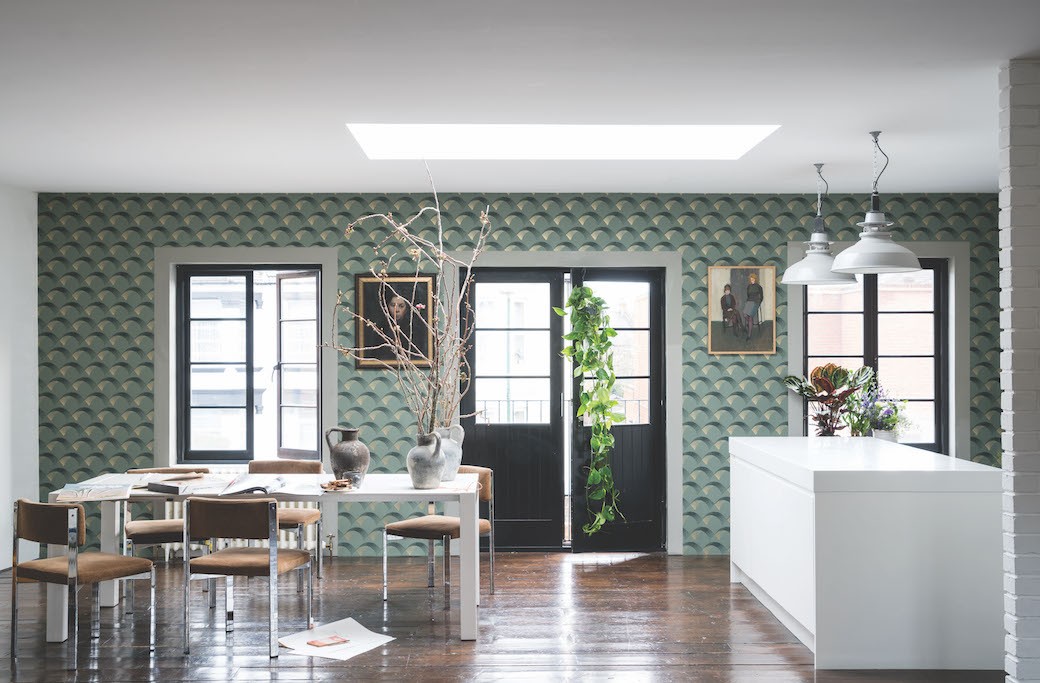
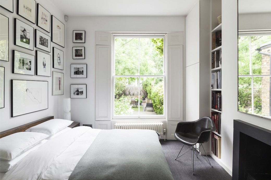
Back in November I shared the first in a new series of blog posts with photographer Nathalie Priem, and I’m delighted to be sharing another – and another London home, this time in Stockwell, which was redesigned by architect Michela Bertolini. This property has evolved over the years as parts of the house were initially rented, and the owners have been working with Michela to reconfigure the spaces.

Michela Bertolini Design Studio describes the ethos of her practice as “timeless simplicity, combined with an attention to precise construction detailing. We are drawn to textures and materials, to natural light and the emotional link that forms between people and places.” I caught up with Michela towards the end of year to ask a few questions about this project, and how that timeless simplicity is reflected in this beautifully redesigned ground and garden apartment.

Continue Reading…

Spaces

KEEPING IT SIMPLE

24th December 2016

I must admit, Christmas has crept up on me this year. I was in denial, more or less, until last week, when it hit me that I really needed to start planning – for Harris if not myself! The build-up to Christmas can feel too much – too much pressure, too many adverts. Just too much. It hardly fits with my less is more approach!

And then, as I was looking through Christmas images I came across the beautiful photo above of the Byrne Table Planter from Rowen & Wren and realised that this kind of Christmas styling was right up my street. I’m going to recreate this look for our dinner table tomorrow as I already have a very similar planter waiting to be dug out and filled with fir branches and candles. So I thought I’d round up a few photos as inspiration for (yes, tomorrow’s!) festive styling.

Continue Reading…

Spaces

GREEN MOOD

10th November 2016

I must admit, it feels strange to be blogging about interiors this week when they’re so much going on elsewhere in the world. It’s been tricky getting my head into blog mode with so much to read, watch, and digest. So I thought I’d share something short and simple – and Scandi!

I spotted this apartment on Gravity Home on Tumblr and headed to Elle Decoration to check it out. Why? Because of the green – this hue just feels so rich and moody. After my previous post on Farrow & Ball’s AW16 wallpaper collection where I mentioned being in a dark blue phase, it seems that the company’s Arcade wallpaper has got me thinking about green.

Continue Reading…

Spotlight

FARROW & BALL AW16

4th November 2016

I used to write for the weekly property pages in The Scotsman, and the sub-editor who worked on the section would tease me regularly about how often I managed to mention Farrow & Ball in the copy. He had a point – I was and am a fan, always have been, but also this reflected how many period properties I saw and wrote about that featured Farrow & Ball’s beautiful wall colours. I’ve always been particularly drawn to all those lovely whites that aren’t really white but are the most gorgeous and subtle hues, where even the pale tones have so much depth, like Cornforth White – a favourite of mine with a light grey tone. So yes, I’m sold on Farrow & Ball’s paint colours, but I’m also a fan of their wallpapers.

Continue Reading…

Spaces

MELBOURNE KITCHEN

19th October 2016

I love when I happen across a photo while scrolling on Pinterest and click through only to find a fantastic house, as was the case when I repinned this photo (below) from Inside Out and came to this dramatically redesigned 1970s home in Melbourne, which was featured in the magazine. The entire house has been beautifully designed by Chelsea Hing – you can find the gallery of photos by the very talented Eve Wilson here – but the space that really caught my eye was the light-filled dining and kitchen zone.

Continue Reading…