Browsing Category

Spotlight

Spotlight

BOTANICAL ALPHABET

27th June 2017

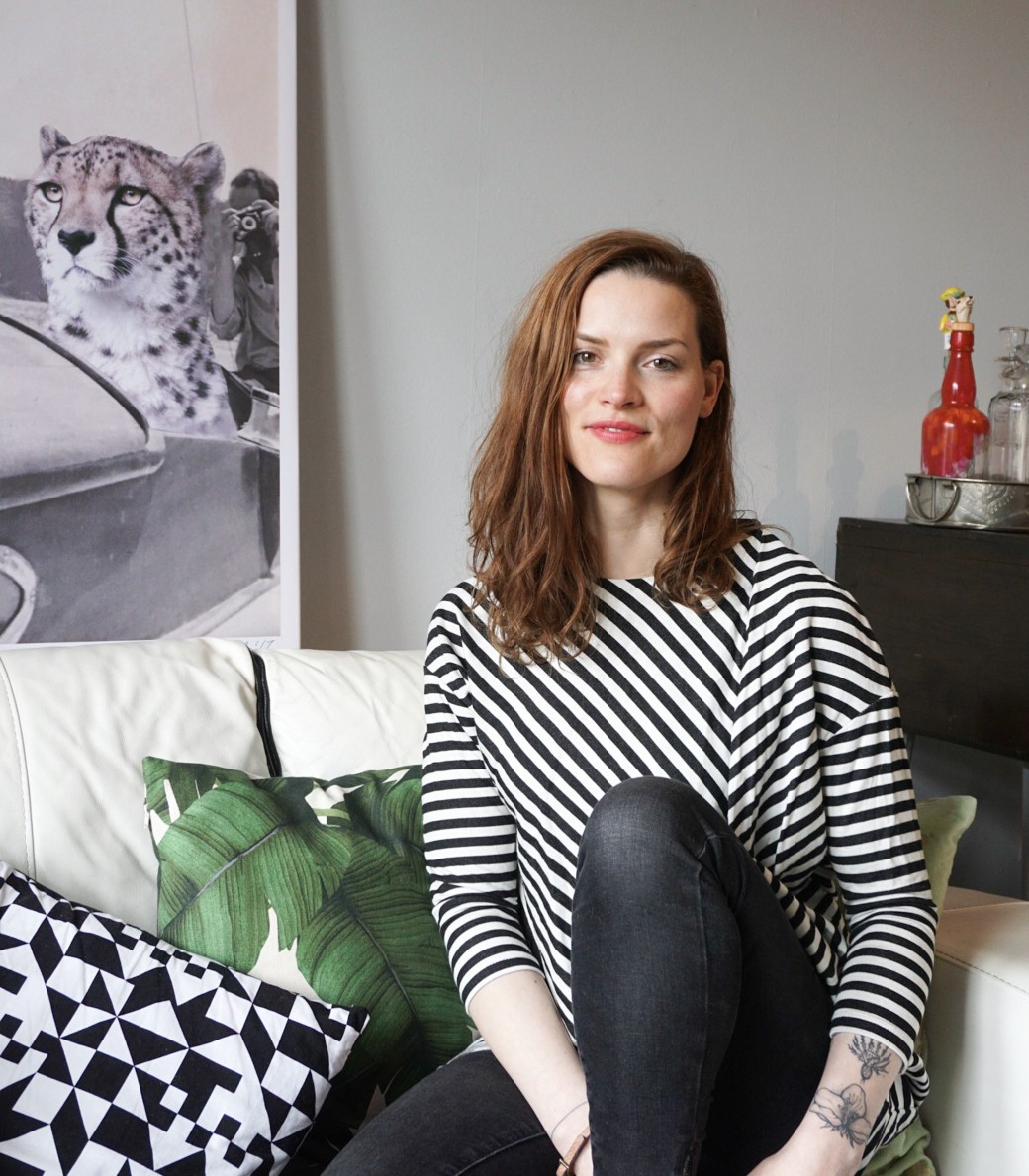
A few weeks ago I was introduced to the work of Edinburgh artist Dodo Flugge of diedododa, and I immediately connected with her collection of Botanical Alphabet prints. I’ve long been an admirer of vintage botanical illustrations, so this particular collection from Dodo, which was inspired by her fascination with botany, was bound to resonate, but interestingly Dodo has combined her delicate botanical drawings with bold typography to create this striking range of prints.

Self-taught artist Dodo creates a unique and ever-changing selection of prints, cards and accessories using a variety of mediums, and her work is diverse, from detailed ink drawings such as the Ink Birds collection to Exotic Bird Paintings to the graphic juxtapositions of The Three Graces. I caught up with Dodo to ask about her work and specifically the inspiration behind the Botanical Alphabet prints.

Continue Reading…

Spotlight

AS LONG AS YOU LIKE

11th May 2017

Back in February I shared a post about Lundhs Real Stone worktops, otherwise known as ‘the kitchen worktops I’d like to have in my future home’, so perhaps I don’t need to explain why this latest collaboration between the Norwegian stone specialist Lundhs and the British and Norwegian design duo Thomas Jenkins and Sverre Uhnger caught my eye. Featuring Lundhs Blue stone combined with solid oak, this design collaboration is called As Long As You Like and offers a series of unique handmade dining tables that can be tailored to any length.

Continue Reading…

Spotlight

SAVOY

24th April 2017

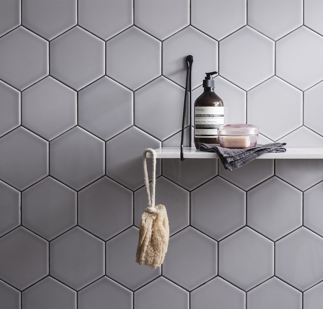
While I’ve always imagined that my future kitchen or bathroom would feature white subway tiles – as it’s a timeless look that I can’t get enough of – I was considering a project over the last few weeks that challenged this ideal. The kitchen in question was tucked at the back of an open plan living space, so it was darker than most, while the bathroom was internal, and I realised that while white subway tiling could look great in both spaces, deeper and warmer tones could look even better.

Continue Reading…

Spotlight

CHECK BY NEISHA CROSLAND

10th March 2017

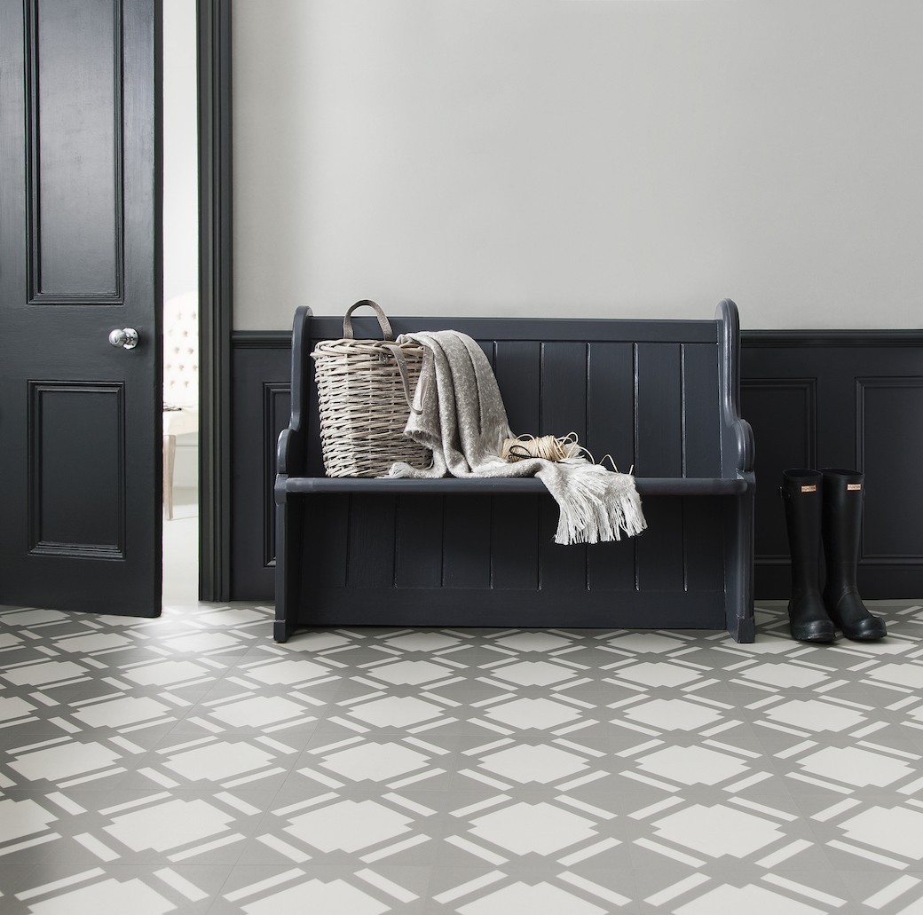
Over the years – and certainly since Harris came trotting into our lives – I’ve become much more conscious of the practical considerations when looking at floor coverings. Now my checklist starts with: what’s easy to clean, as you can’t avoid wet paw prints after a damp walk or a bath. And I seem to be incapable of walking across the kitchen without somehow kicking over Harris’s water bowl. All the time. Also, what’s warm underfoot and would work with underfloor heating, as this is definitely on my wish list for our future bathroom. And while I’d always choose timber for a main living space and bedrooms, with a kitchen, bathroom or hallway I can see myself leaning towards something a little different.

Which is why this new collection by Neisha Crosland for Harvey Maria caught my eye. I shared a range of flooring designed for Harvey Maria by Dee Hardwicke on the blog last year, and this latest collection of vinyl tiles designed in collaboration with Neisha Crosland combines a bold geometric pattern with a neutral and elegant (and dare I say very ‘me’) colour palette.

Continue Reading…

Spotlight

CLEMENT BROWNE

3rd March 2017

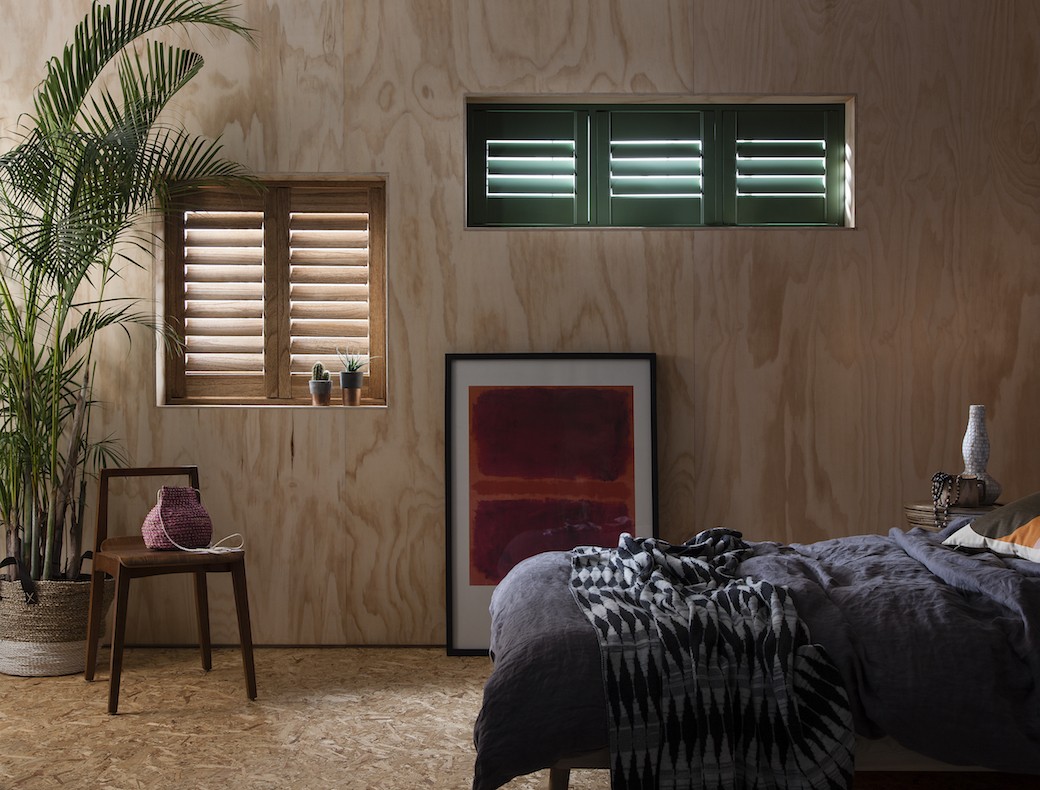
I’ve been a fan of window shutters for a long time – since living in my first flat in Edinburgh when I realised that, both in terms of aesthetics and heat, shutters really work. I love their clean lines on a window, and on a cold night, nothing beats shutters. That’s been really noticeable since moving into my current flat: every window has original Georgian shutters apart from the kitchen and bathroom, and you can feel the cold coming in those single glazed astragal windows on a chilly night. Simply closing the shutters shifts the temperature and creates a more snug mood.

How do you create this look but make it work in a contemporary context? Look no further than Clement Browne.

Continue Reading…

Spotlight

LUNDHS

22nd February 2017

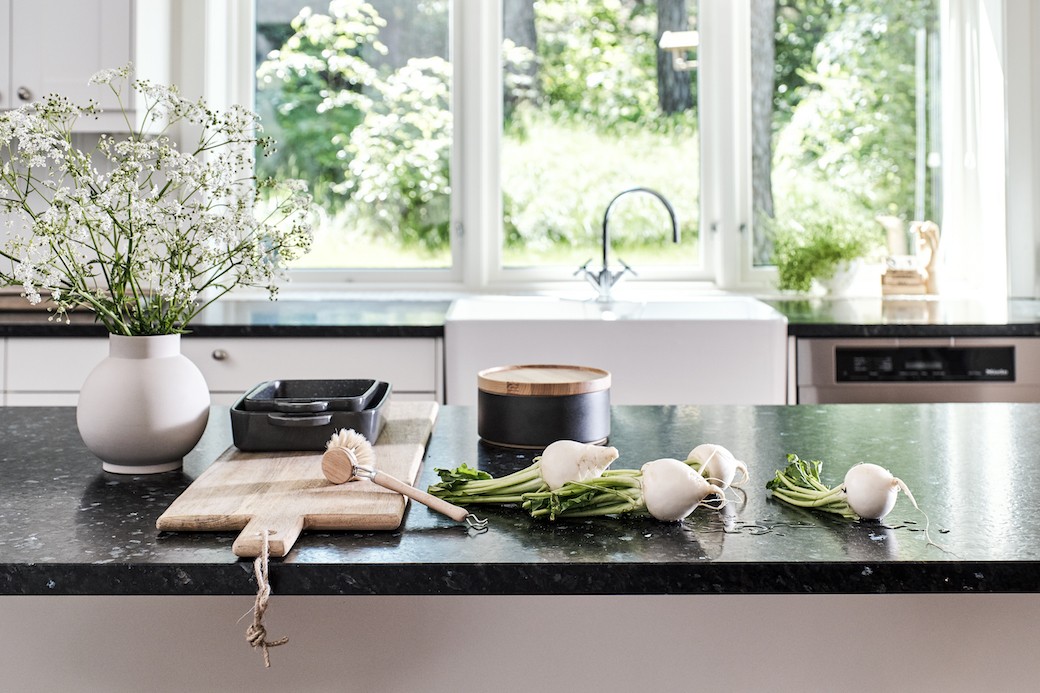
Given my addiction to all things Scandi, it’s perhaps no surprise that these images from the Norwegian stone specialists Lundhs caught my eye. When I was choosing a new worktop for my own kitchen a few years back, my default mode was to opt for natural stone. (I should explain, while I rent, I’m really fortunate to have a landlord who understands that a tenant who looks at interiors for a living is a good person to get involved when considering any home improvements!) We considered granite in various colourways, but in the end I realised that I really didn’t want a high gloss finish. I wanted something matte, something quiet. I opted for this Silestone and it’s beautiful, but had I come across Lundhs Real Stone worktops, and specifically their silk matte finish stone, well, my kitchen might have looked a little different today.

Continue Reading…