Browsing Tag

decor

Spotlight

SAVOY

24th April 2017

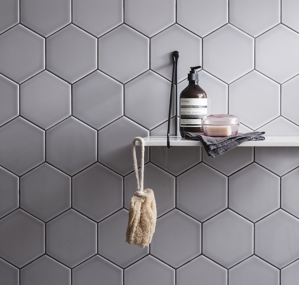
While I’ve always imagined that my future kitchen or bathroom would feature white subway tiles – as it’s a timeless look that I can’t get enough of – I was considering a project over the last few weeks that challenged this ideal. The kitchen in question was tucked at the back of an open plan living space, so it was darker than most, while the bathroom was internal, and I realised that while white subway tiling could look great in both spaces, deeper and warmer tones could look even better.

Continue Reading…

Spotlight

THE TREVERKMADE COLLECTION

11th January 2017

It’s no secret that I’m a (massive) fan of chevron parquet flooring, so you can understand why these images from Gemini Tiles caught my eye. But hang on, tiles? Tiles that look like parquet? Yes indeed, the new Treverkmade Collection from Gemini Tiles combines the aesthetic we all love from natural timber with the practicality and durability offered by a tiled finish, making this a great choice for bathrooms where timber isn’t the most practical of options – and I say this from experience having lived with a painted wooden floor in our own bathroom for years. (It looked fantastic on day one, but considerably less so now!)

Continue Reading…

Spaces

GREEN MOOD

10th November 2016

I must admit, it feels strange to be blogging about interiors this week when they’re so much going on elsewhere in the world. It’s been tricky getting my head into blog mode with so much to read, watch, and digest. So I thought I’d share something short and simple – and Scandi!

I spotted this apartment on Gravity Home on Tumblr and headed to Elle Decoration to check it out. Why? Because of the green – this hue just feels so rich and moody. After my previous post on Farrow & Ball’s AW16 wallpaper collection where I mentioned being in a dark blue phase, it seems that the company’s Arcade wallpaper has got me thinking about green.

Continue Reading…

Spotlight

FARROW & BALL AW16

4th November 2016

I used to write for the weekly property pages in The Scotsman, and the sub-editor who worked on the section would tease me regularly about how often I managed to mention Farrow & Ball in the copy. He had a point – I was and am a fan, always have been, but also this reflected how many period properties I saw and wrote about that featured Farrow & Ball’s beautiful wall colours. I’ve always been particularly drawn to all those lovely whites that aren’t really white but are the most gorgeous and subtle hues, where even the pale tones have so much depth, like Cornforth White – a favourite of mine with a light grey tone. So yes, I’m sold on Farrow & Ball’s paint colours, but I’m also a fan of their wallpapers.

Continue Reading…

Spaces

DEE HARDWICKE FOR HARVEY MARIA

5th April 2016

“We think floors should be celebrated, adorned and given the same status as the walls and furnishings,” Harvey Maria writes on their website, and I must admit, after looking through the company’s latest collections, I can only agree. While my default mode has always been for simple timber flooring – unless we’re talking about historic floor tiles, like the Victorian encaustic tiles I admire in properties around Edinburgh – I was hooked on Harvey Maria’s patterned vinyl flooring the moment I laid eyes on Neisha Crosland’s award-winning Parquet floor tiles. Here was a floorcovering that I couldn’t definitely imagine having at home – warm underfoot, hardwearing enough for small paws, and stylish.

The company has collaborated with some of Britain’s best-loved designers, and 2016 sees the launch of the latest range created for Harvey Maria by the designer Dee Hardwicke.

Continue Reading…

Spaces

COLOUR POP

21st January 2016

If you’ve been following Copperline for a while, you’ll already be well aware of my grey obsession. But while my default setting is grey-toned, Im always inspired when seeing how other people use colour, and this contemporary house in the States caught my eye for its colour-pop accents played against clean chalky whites.

Continue Reading…