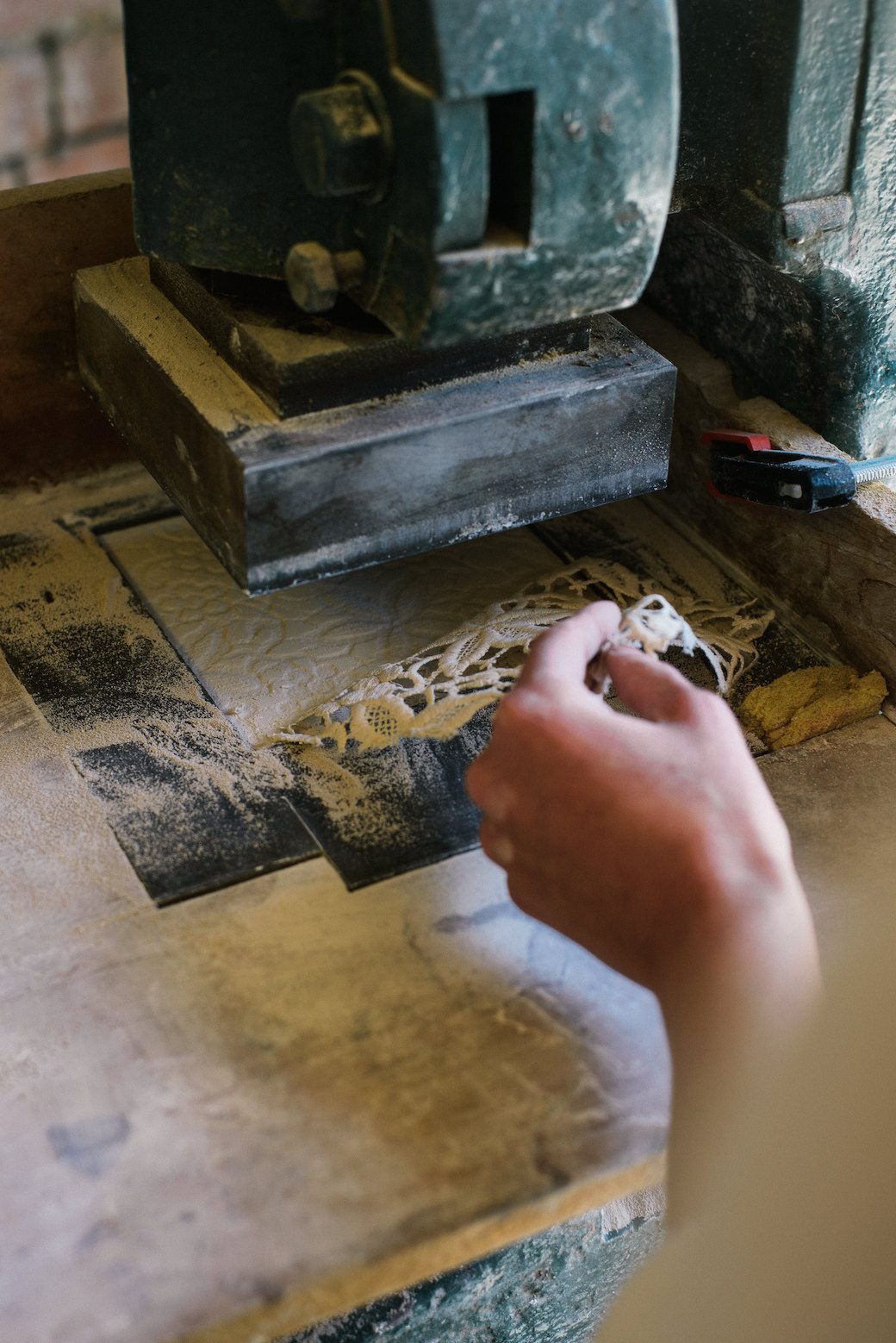
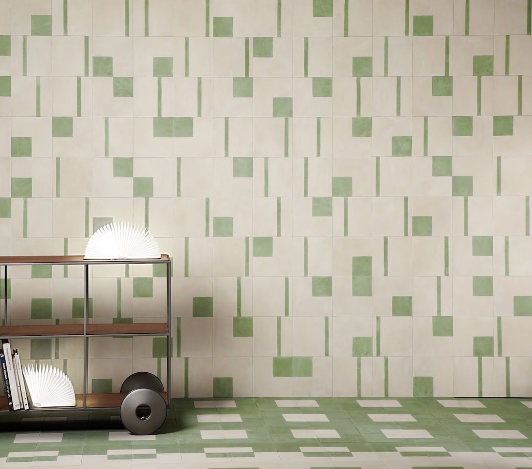
Last summer, back in the days when life was still ‘normal’ and we thought nothing of getting in the car and going places (remember those days?), we went to visit Holyrood Architectural Salvage in Edinburgh looking for something for the garden. As we were wandering around, I spotted an array of vintage tiles that were arranged by pattern in small batches, and as I was looking at them, admiring their rich hues and retro feel, I was wondering what someone might use them for. As that’s a problem when considering period tiles: finding enough of the design or style you want to work for the project you might have in mind.
I couldn’t resist this new wallpaper collection from Mineheart when it popped up as I was scrolling through products for the weekly interior news page I compile for a newspaper. At a glance, this ‘Back To Nature‘ design by Australian illustrator Courtney Brims feels like a classic flowers and fauna design, but then hang on, is that a snake I see…?
If you’ve been following here for a while you’ll know that I’m a big fan of Farrow & Ball’s beautiful colour palette, and also, more recently, of their wallpaper collections. Last year, I featured the wallpaper collection for AW16, and I must admit that I’ve been hankering to use the gorgeously simple Art Deco-inspired Arcade print ever since, particularly in the 5307 colourway.
Farrow & Ball have recently launched the AW17 collection of wallpapers, and have taken inspiration from the current trends of texture, maximalism and a return to nature. The new collection features three contemporary floral wallpapers – think florals that are fluid and expressive, where each wallpaper has a tactile, almost three dimensional finish that’s been achieved by printing paint on paper.
This year, as we’ve been looking at moving, every property we’ve seriously considered has sent me into redesign mode. Kitchens, bathrooms, flooring… my head has been full of ideas for different types of spaces, and one of the design features I’ve kept coming back to again and again is geometric tiling.
So this new collaboration between Bert & May and The Conran Shop was bound to catch my eye. Designed by The Conran Shop and created by Bert & May’s skilled makers, the collection – which is currently showcased at Bert & May’s east London showroom on Vyner Street during London Design Festival (until 24th September) – features six designs in three complementary colourways.
I realise it’s still summer, and I probably should still be thinking about summer light and summer palettes, but I feel like I’m being drawn to the dark side at the moment. I’ve been helping my Mum with her new kitchen and bathroom redesign, and it’s all dark: riven slate-effect cladding on the bathroom walls and off-black kitchen cabinetry. Even the appliances are black, as is the kitchen tap. I think my head has been so full of this colour palette that I’m being drawn to certain finishes as a result.
Which brings me to this gorgeous Nero Marquina collection of tiles from Original Style – a matt-finish porcelain that looks like marble.
I came across this apartment the other day on HomeDSGN while scrolling for inspiration, and as I couldn’t see any photo credits I did a quick search to track down some background of this apartment. The original article appeared in Swedish Elle Decoration and this stunning apartment is the Gothenburg home of interior designer Sara Gerum and her craftsman husband Christoffer.