So hello. It’s been a while – since September last year to be precise. I took a blog break that became an extended blog break, and then I wasn’t sure when or indeed if I was coming back here. I’d been working on some other ideas – hopefully a new venture this year. I decided to spend less time at my desk. But I kept bookmarking ideas for blog posts. And occasionally an email would arrive with a great product range and I’d immediately think, ‘I have to blog about this…’ So I’ve been saving ideas waiting for the time when I wanted to sit down and write – and if I decided not to, well, that was fine too.
And then yesterday I was browsing Dezeen and I spotted this house. Random, but interesting, and it reminded me that I used to enjoy blogging about random and interesting things. Not planned posts as such. Just things I liked. Wasn’t that why I started Copperline in the first place? So, the best way to start writing anything again is just to start.
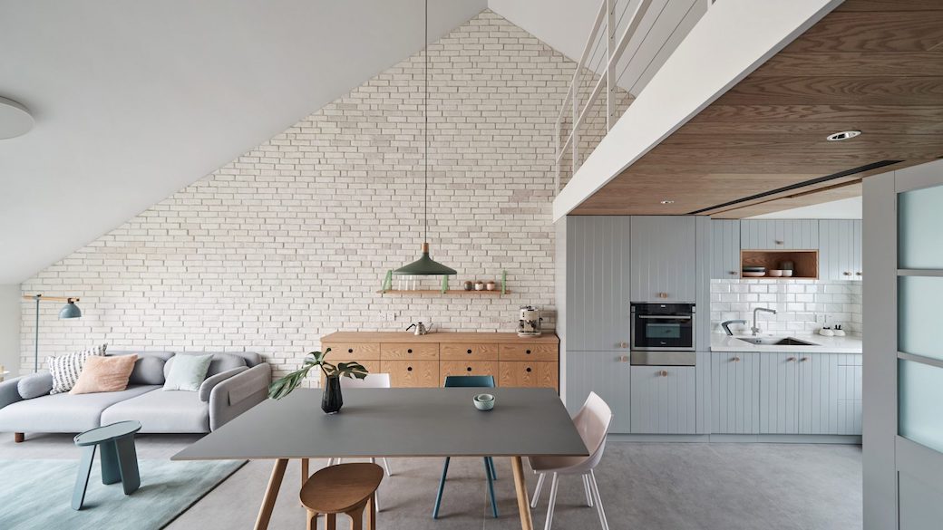
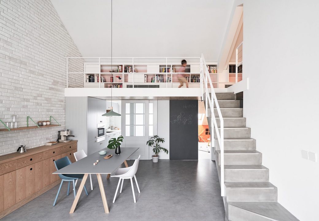
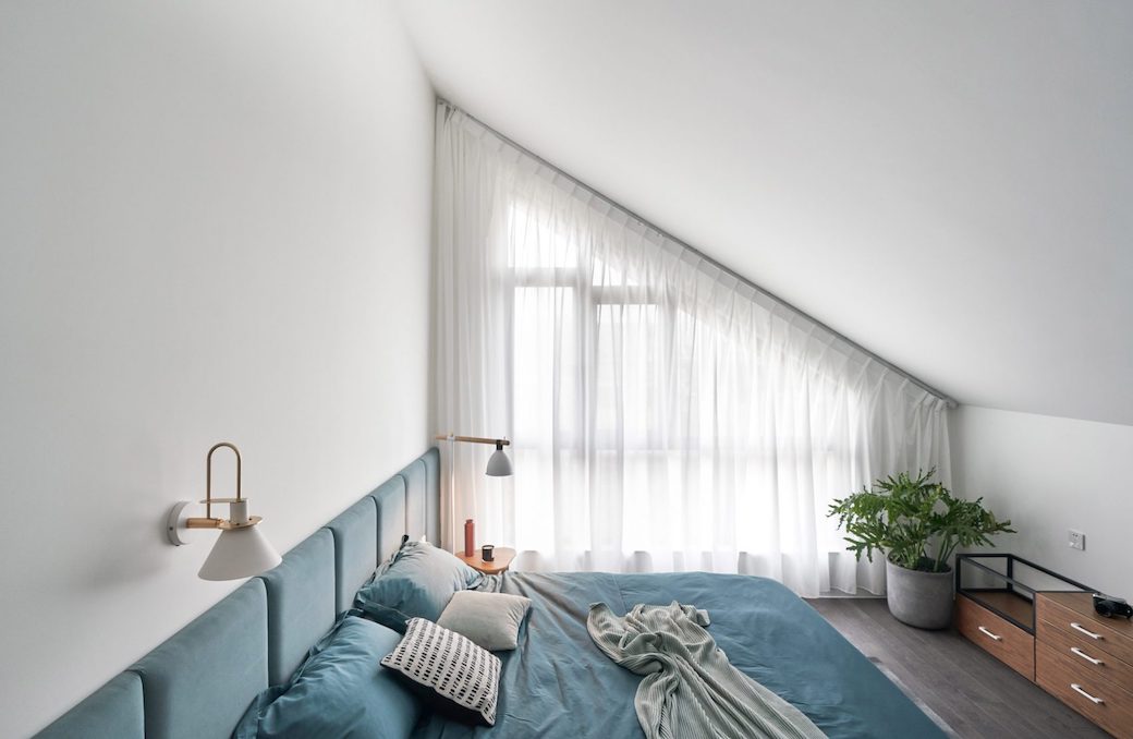
This is Starburst House. Dezeen’s headline caught my eye: ‘HAO Design uses pastel hues for pitched-roof apartment in Beijing’. Pastels? This isn’t a colour palette I’d normally be drawn to, but then scrolling these photos (by Hey!Cheese) I couldn’t help by admire this soft array of hues, from the powdery blues to the chalky pinks that are offset by the gentlest of cloudy grey tones and warm timber finishes.
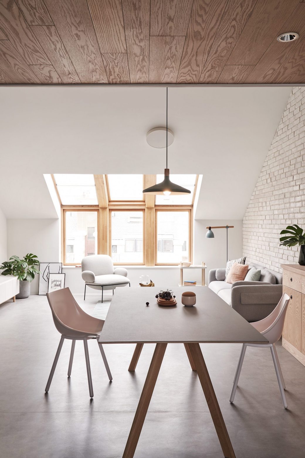
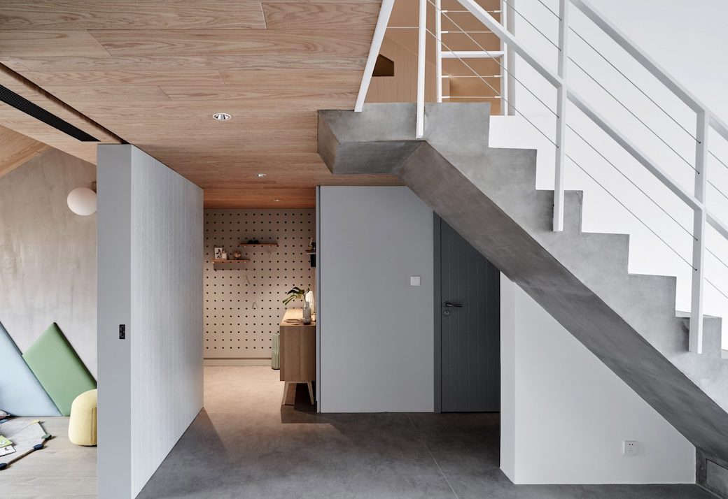
The owners are a young couple who purchased the 116 sq/m apartment as a shell and then approached the Taiwan-based practice HAO Design Studio to recreate the space as a family home. The asymmetrically pitched roof enabled the design team to insert a mezzanine level for the son’s bedroom and a second bathroom, along with a small work space, while the ground floor is given over to an open plan living, dining and kitchen area, along with a playroom and the master bedroom.
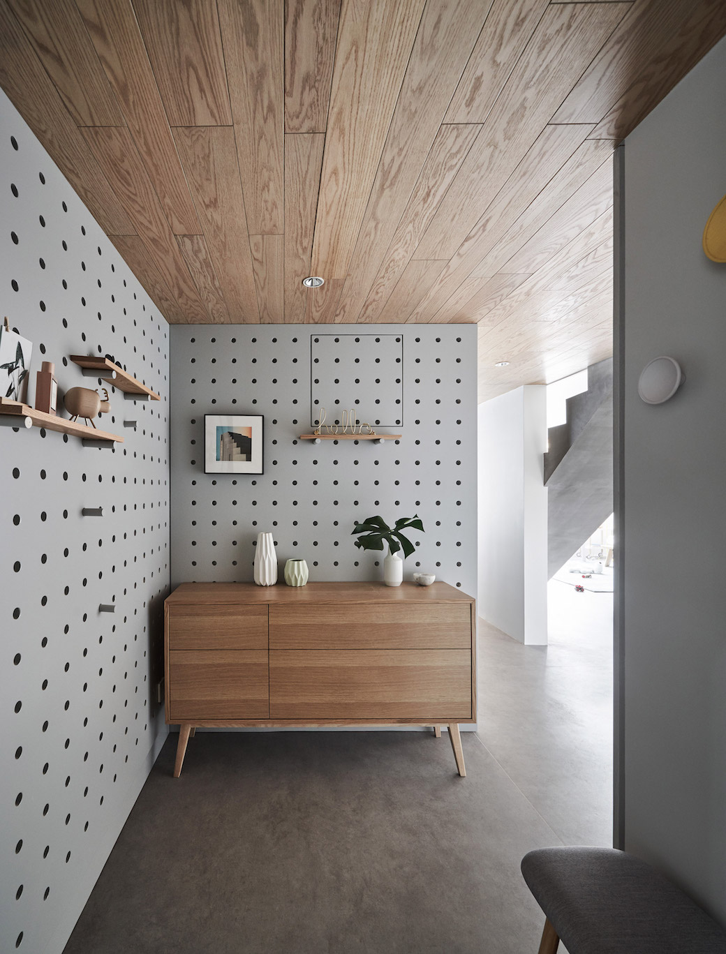
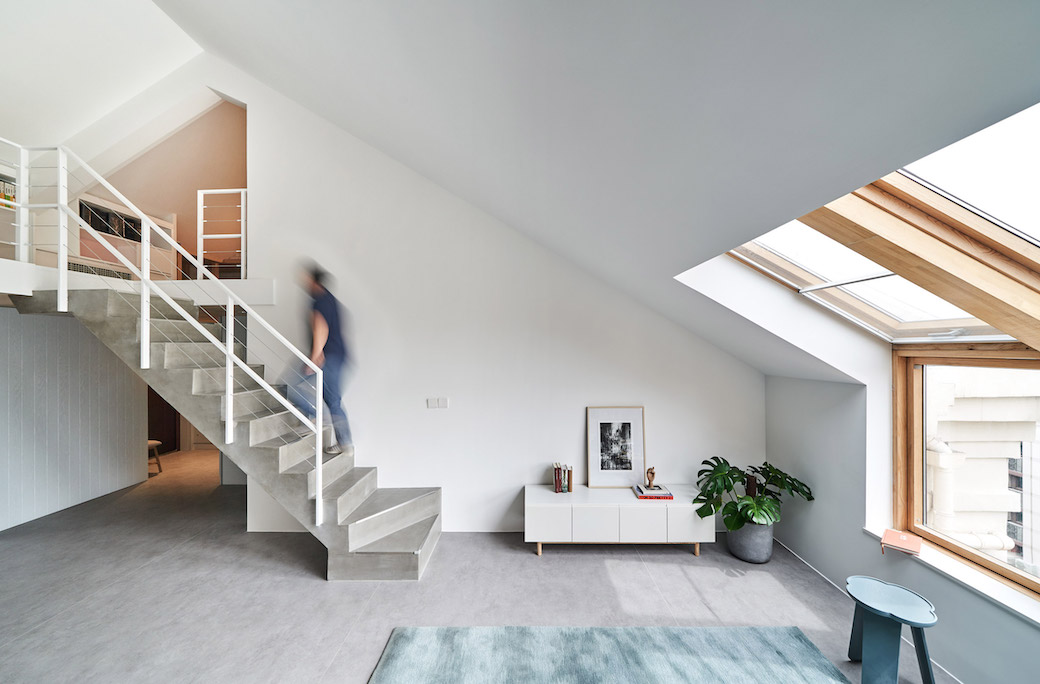
The pastels offer the most subtle of accents against the timber and concrete finishes. I particularly like how the concrete staircase appears so ‘solid’ and grounded with this light-filled space, creating a strong core that the living space flows around, and the polished concrete floor has a similar effect in again grounding the interior. The timber panelled ceiling adds to the tactile palette. The ‘decoration’ here is so subtle: the grains in the wood of the ceiling; the gentle tonal shifts in the floor; the perforated wall finish in the hallway, which feels fun. Exposed brick adds a slightly industrial edge to the main living area.
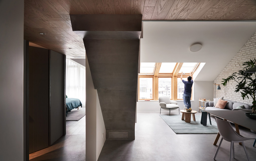
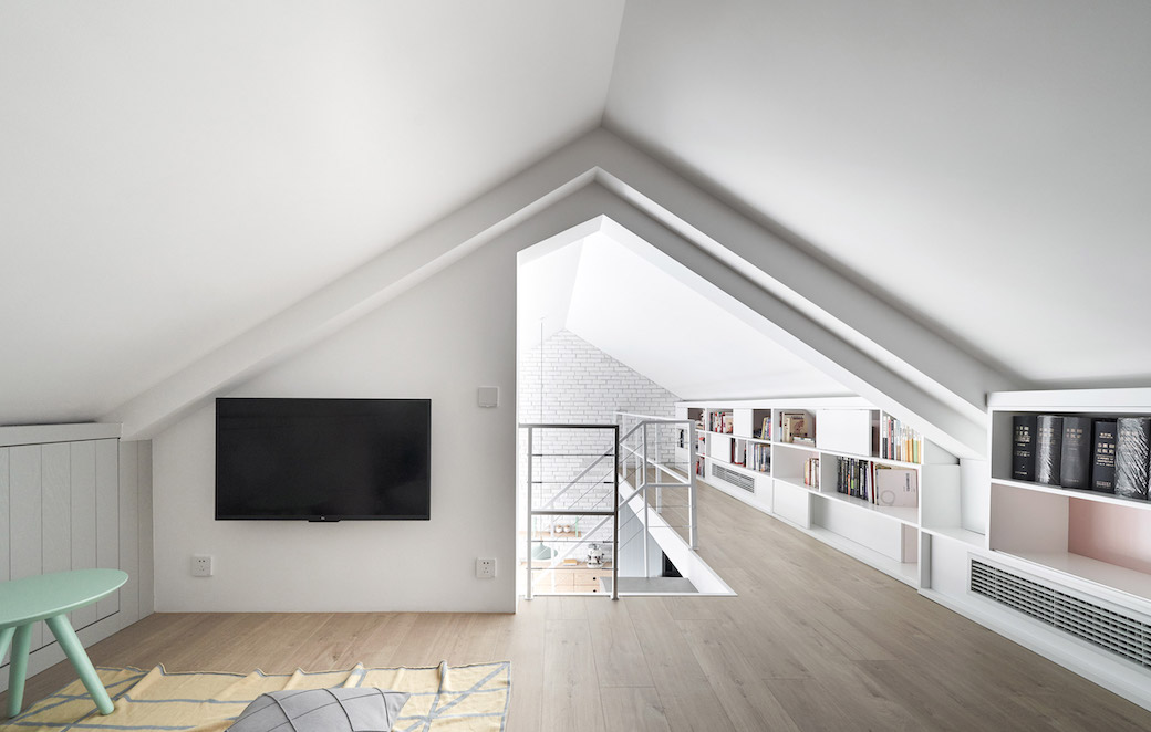
I also like the wall of open shelving that’s built into the eaves on the upper level, with that chalky pink used on the wall behind so that the colour is revealed in the alcoves. The angles of the roofline create some interesting geometry on this floor – in the photo below, that roof height looks low! Which I personally find interesting as our own attic bedroom comes with a deeply coombed ceiling – a feature I’ve got used to quickly (after hitting my head on the ceiling for the first few weeks here!) and that just adds to the quirky character of the house. I imagine the same is true here. When you’re working with a slightly unusual space, the key is working with it, as here with the roofline, and making a highlight of the unexpected.

And while the headline about pastels drew me to this space, it’s actually these details, and the use of materials, that make this apartment an interesting home for me.
Photography by Hey!Cheese via Dezeen.