If you’ve been following Copperline for a while, you’ll already be well aware of my grey obsession. But while my default setting is grey-toned, I‘m always inspired when seeing how other people use colour, and this contemporary house in the States caught my eye for its colour-pop accents played against clean chalky whites.
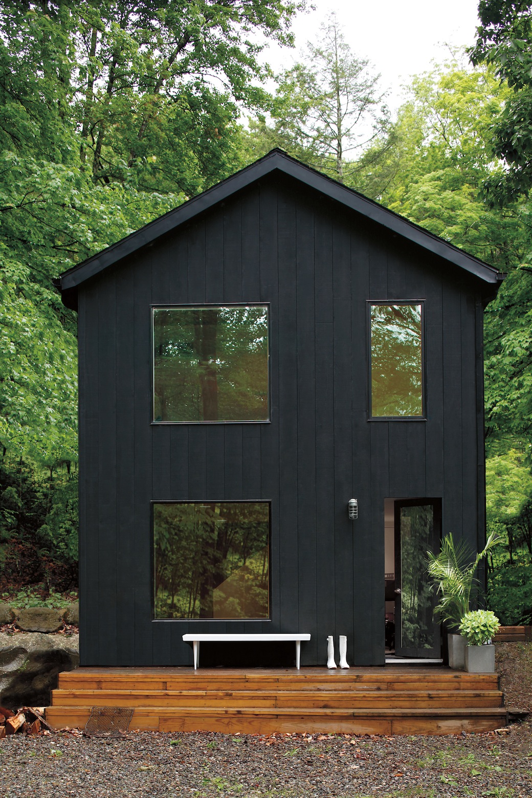
This is the home of a digital designer, and the interior illustrates the high chroma colours from Benjamin Moore Paint‘s 2016 Trends Palette. I have a thing for black timber-clad houses, and one of the delights of this house is the contrast between the all-black exterior and the pristine and light-filled interior, where black is used as an accent both in the furnishings and in features – the frame of the glazed front door, for example, is painted in Black Ink.
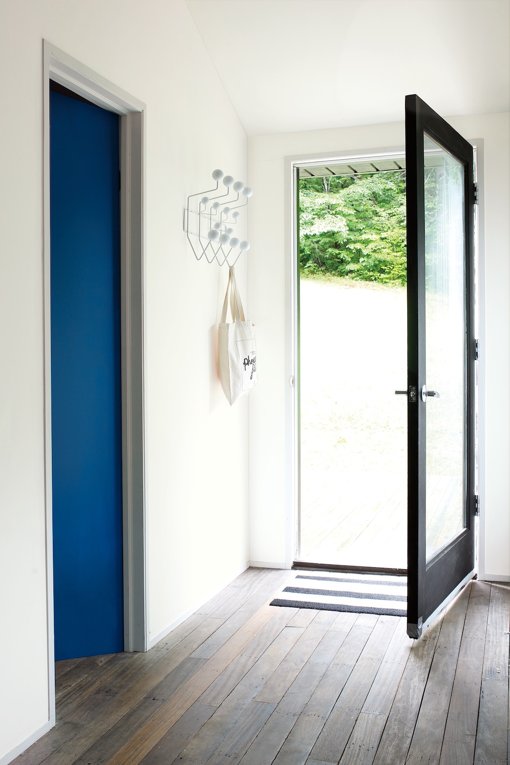
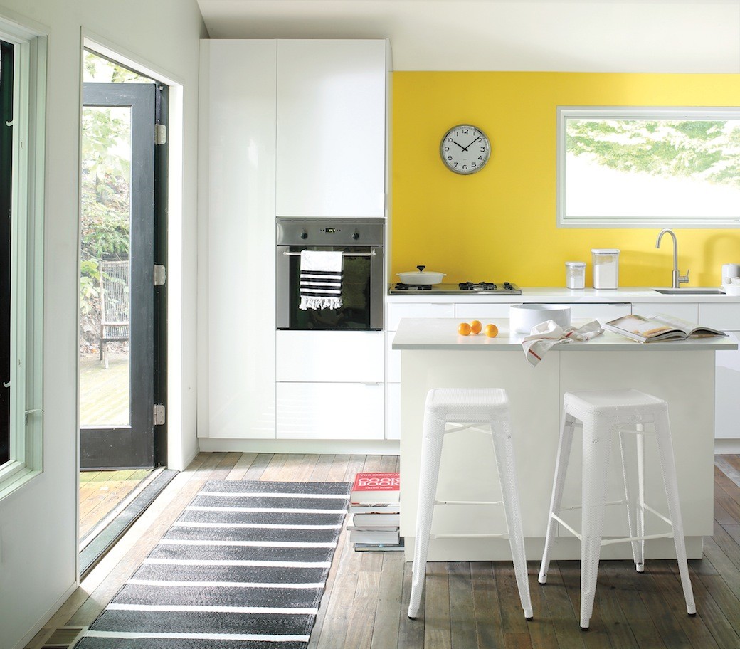
And here in the hallway you can see how the homeowner has used colour to create impact, whether drawing your eye towards a doorway painted in Patriot Blue, combined with Ice Mist on the walls, or in the kitchen area above, where the owner chose Banana Yellow against the streamlined white kitchen cabinetry and bar stools, with the walls and ceiling painted in Paper White. I also like the floorboards throughout – they look reclaimed, with that slightly worn-in patina that offsets the crisp detailing elsewhere.
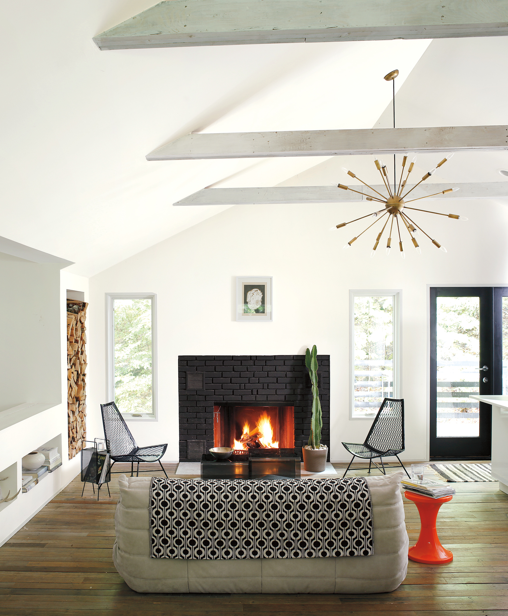
And there is this wonderful living space, which is open plan to the kitchen. The volume with the high beamed ceiling; the simple and graphic black brick fireplace framed by those slender windows; the rustic texture added by the integrated log storage… there is so much to love in this room.
And the white backdrop just works here. Benjamin Moore’s Simply White – the company’s Colour of the Year 2016 – has been used for the walls and the ceiling, and this hue enhances the natural light and volume while drawing your eye to the details and to the glimpses of greenery outside. It’s interesting that this shade of white has been chosen as the Colour of the Year – with so many amazing hues, why white? But white looks different in every light; its tone shifts throughout the day and enhances whatever colour or texture you place alongside it. And white speaks of simplicity. While I dream of a grey interior, I must admit that I currently live with white.
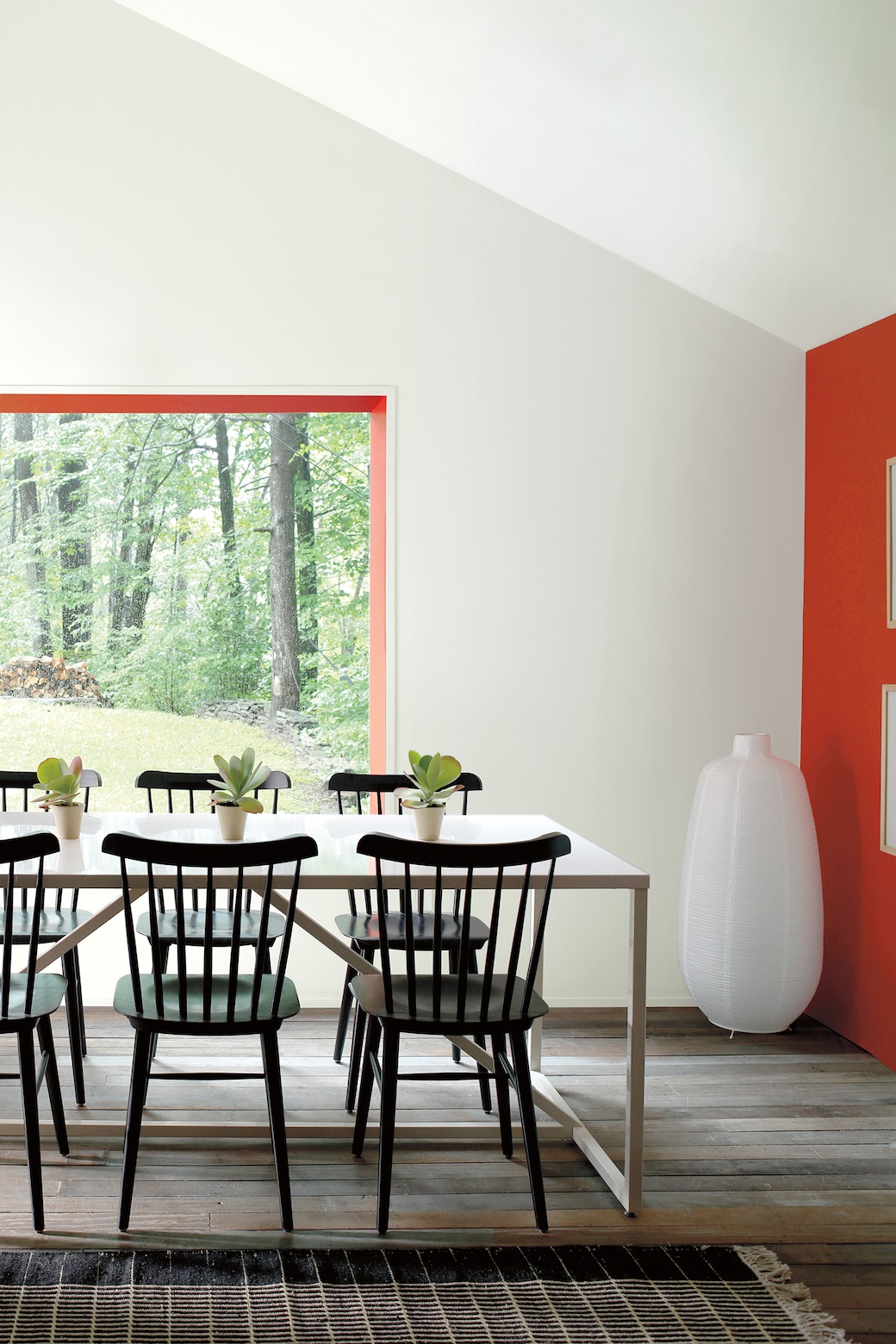
The dining area in this house introduces colour in a slightly unexpected way as Ravishing Red is used both as an accent wall and as a trim on the large picture window, framing the green view, and this punchy hue works alongside the simplicity of the monochrome furniture and the main wall colour of Paper White.
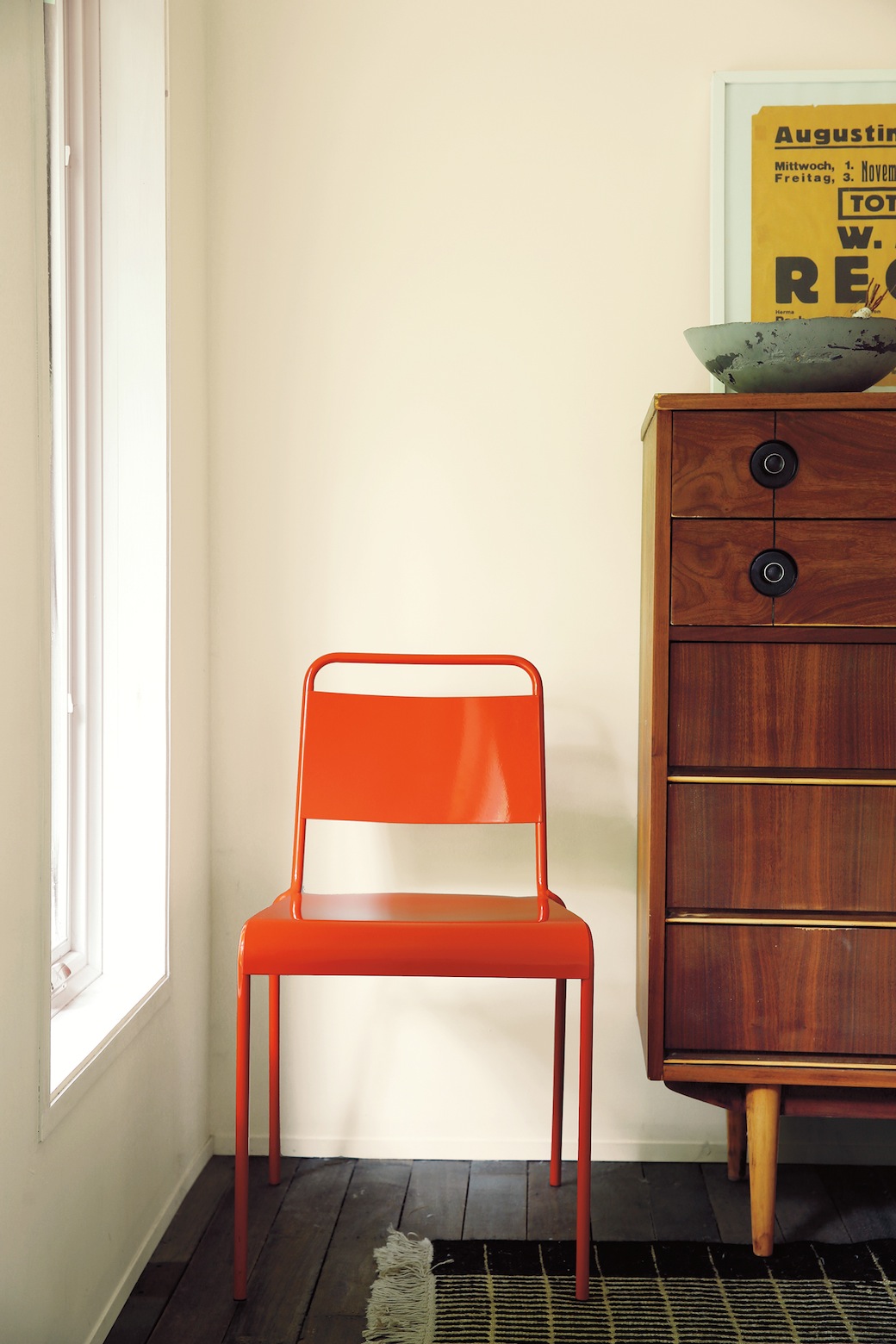
And the homeowner has carried that colour pop approach into items of furniture, as above, where a burst of orange offsets a warm Mascarpone wall colour. While I’ve known of Benjamin Moore’s paint range – which is now distributed exclusively in the UK by Shaw Paints Ltd – I hadn’t appreciated that the company was founded in 1883 in Brooklyn, New York. The brand includes flagship paint lines such as Aura® and Regal® Select as well as the most environmentally-friendly premium paint in the US marketplace, Natura®. The range includes over 3,500 colours.
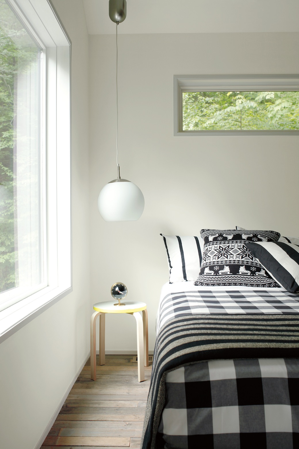
On which, I’m drawn to this super-subtle grey wall colour, Gray Owl, that’s used in the bedroom. This hue, Paper White, and Weimaraner would be my colours of choice from the Colour Trends 2016 Collection – which would you choose?
See the full collection from Benjamin Moore Paint; follow Benjamin Moore on Twitter and Instagram.
All photography from Benjamin Moore.