I can sometimes feel uneasy when writing about colour – other than grey! – possibly because the list of colours that I wouldn’t personally use at home is considerably longer than the list of hues I would. Anything pink, blue (except navy), red… indeed anything bright, if I’m being honest. Other than a really rich orange, which is my exception to the rule. I gravitate towards texture rather than colour.
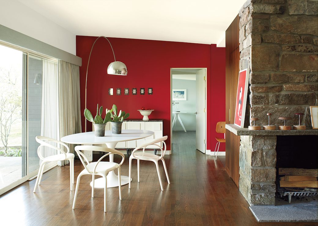
But it’s good to be challenged on this when you come across an interior where colour has been used really well. Take this midcentury home that showcases Benjamin Moore’s 2018 Colour of the Year, Caliente, a vibrant red that’s been described by Benjamin Moore’s Director of Strategic Design Intelligence Ellen O’Neill as “strong, radiant and full of energy.”
Caliente works beautifully in this context, played against rich wood grains and exposed stone finishes, and combined with neutral hues that make this warm red look even more dynamic. Complemented with midcentury and contemporary design pieces, it’s clear that just a little bit of red can go a long way in creating an impact.
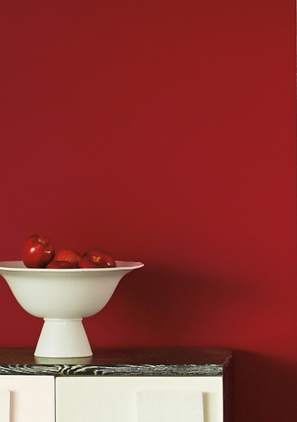
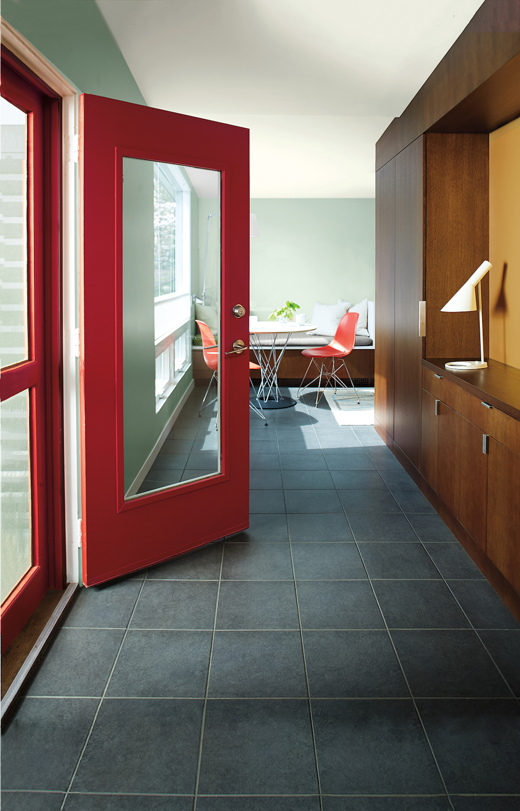
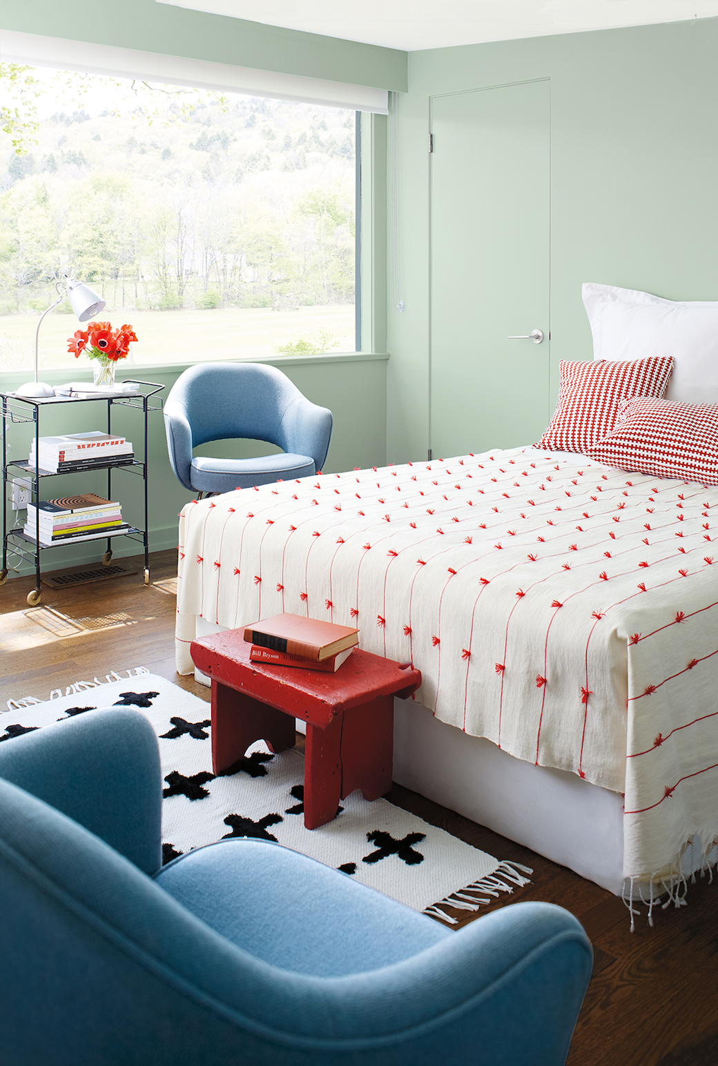
But also, this interior isn’t simply about one standout shade of red: the Colour Trends palette incorporates a full spectrum of reds, from hints of blush to deep oxbloods, and is paired with a beautiful collection of whites and neutrals and complementary bold colours. Which brings me to more familiar territory and a few favourites that are showcased here.
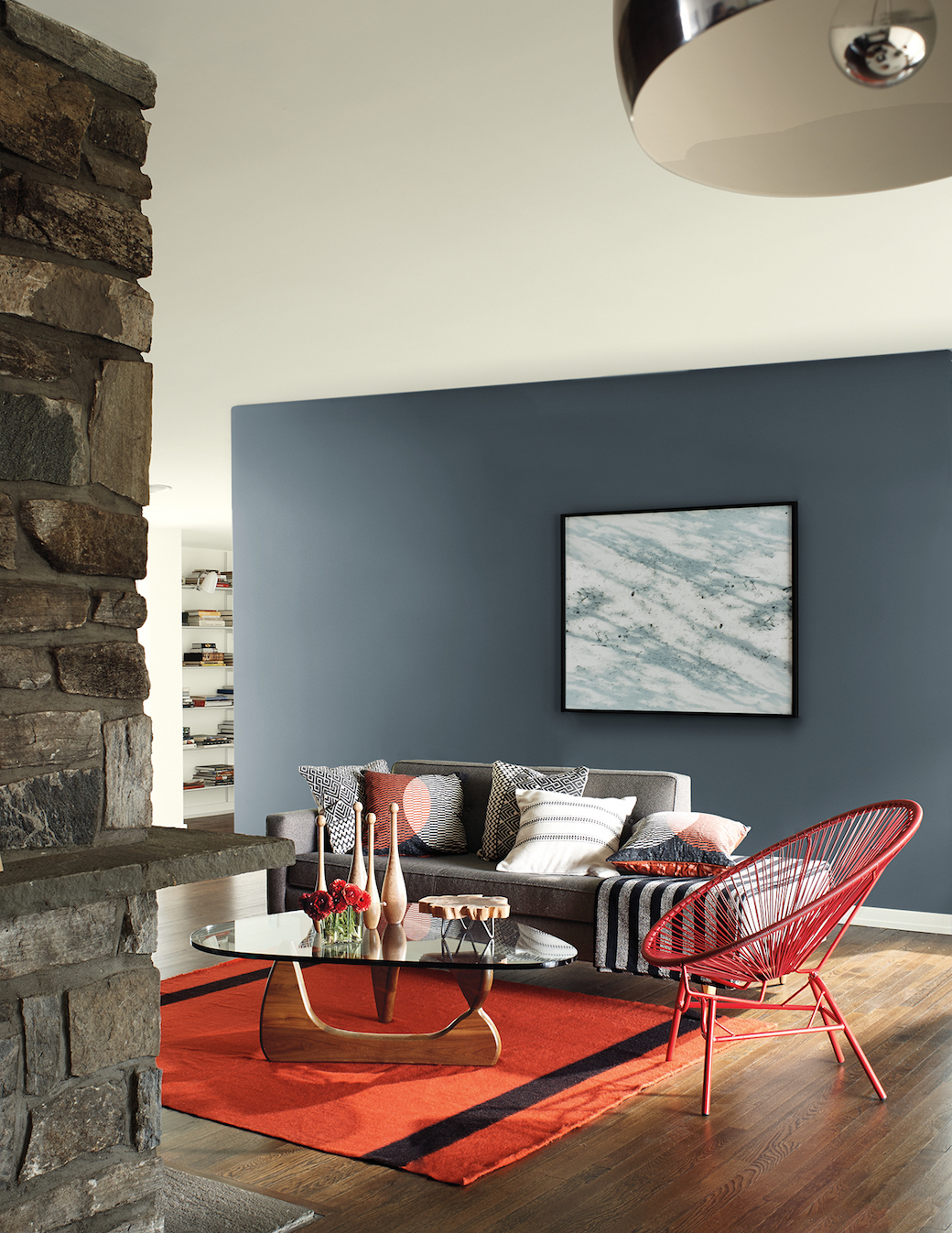
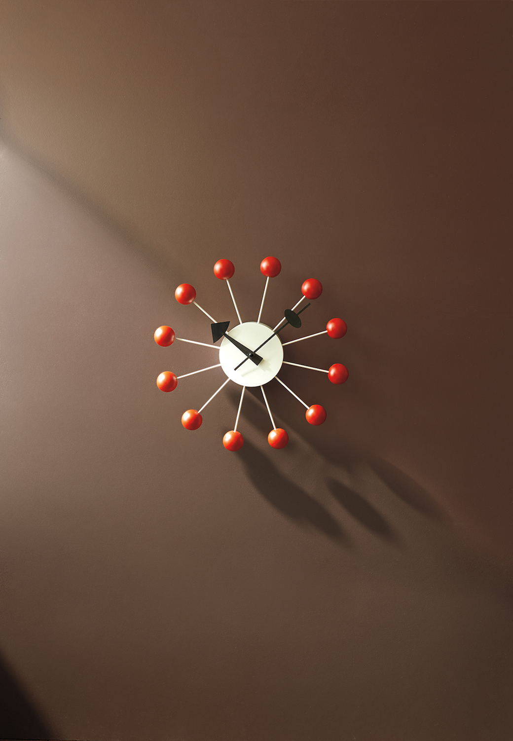
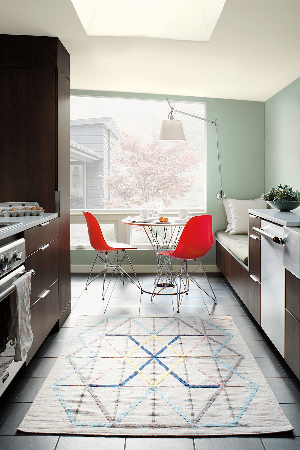
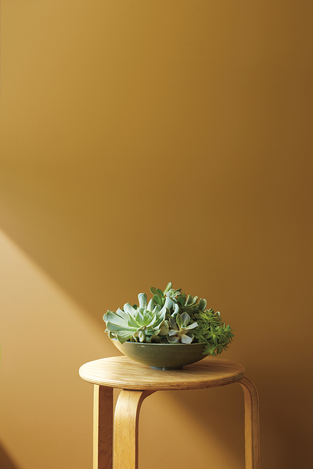
Two of my favourite colours in the house appear here as details: Golden Retriever (yes, great name!), which is a gorgeous yellow-ochre tone with a subtle midcentury vibe (second below), and Incense Stick (above), a beautiful warm brown tone that offsets the classic George Nelson clock. The more I consider this house, the more I’m drawn to the palette, as it balances the vibrancy of red with the warm earthy tones and natural materials – particularly the dark timber floor – and then offsets that warmth with the cooler shades of grey and silvery-green.
Are there colours that challenge you in a similar way? Is there a shade that you would never think to use, but then you surprise yourself when, as with this house, you see it working in a different context?
Photography by John Bessler for Benjamin Moore.
Explore the look here.

Simply beautiful. I just love the colors.
https://www.choicefurnituresuperstore.co.uk/
I am really taken with the Golden Retriever colour! Like you I tend to stick to a palette of greys and I would never have thought I’d ever be drawn to a yellow colour but it really works with the midcentury vibe. I also love the door frame in the red, such an unusual choice but it really makes an impact!
Thanks Lisa! It’s a great shade isn’t it. Like you, I’d never go for a ‘yellow’ but this is so warm and with that slightly retro vibe. Kinda similar to the aforementioned Mini colour!