Browsing Tag

refurbishment

Spaces

BORNE APARTMENTS

7th April 2016

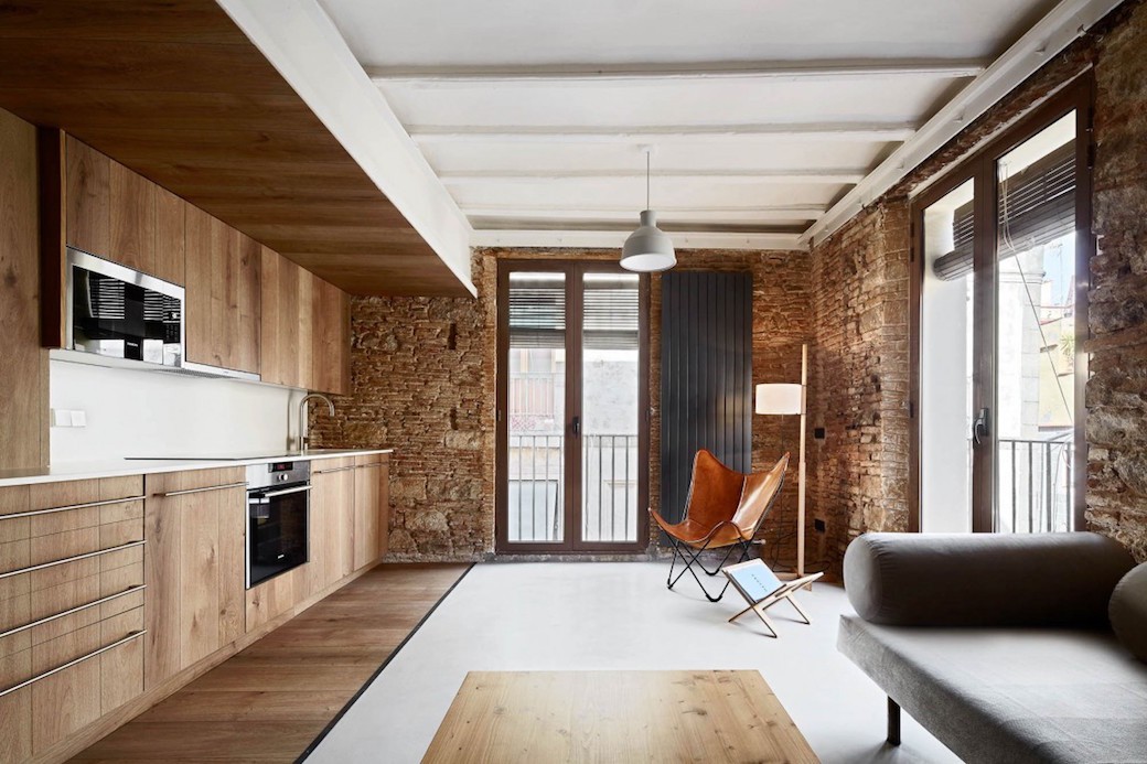
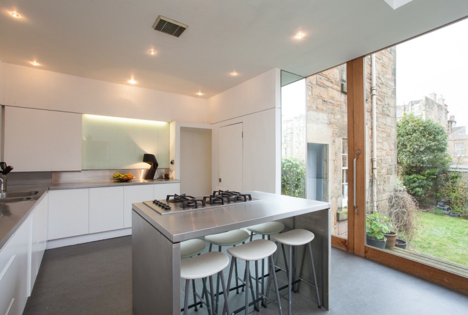
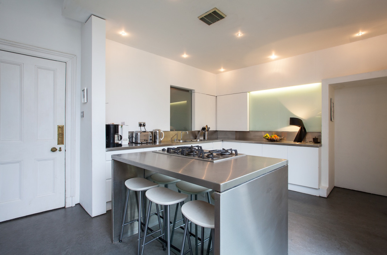
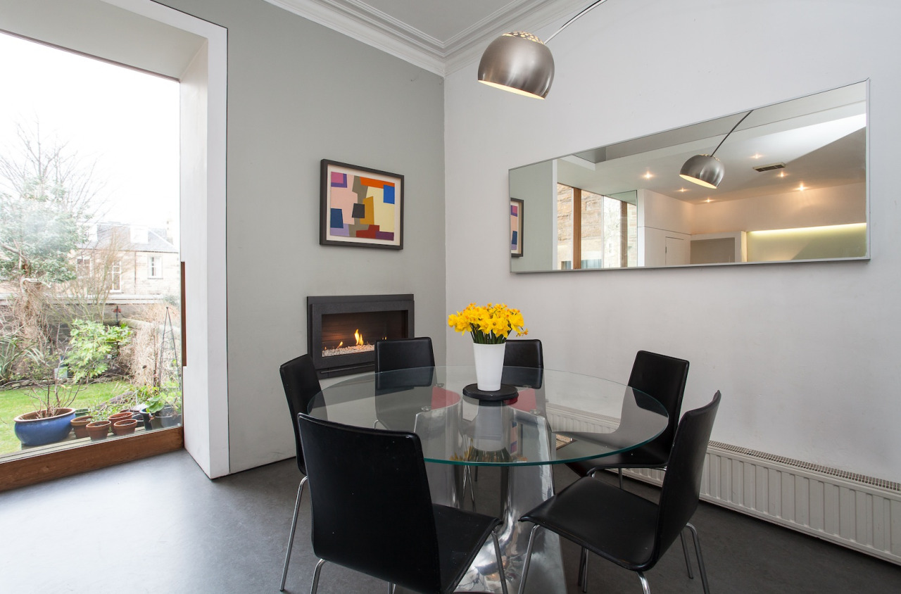
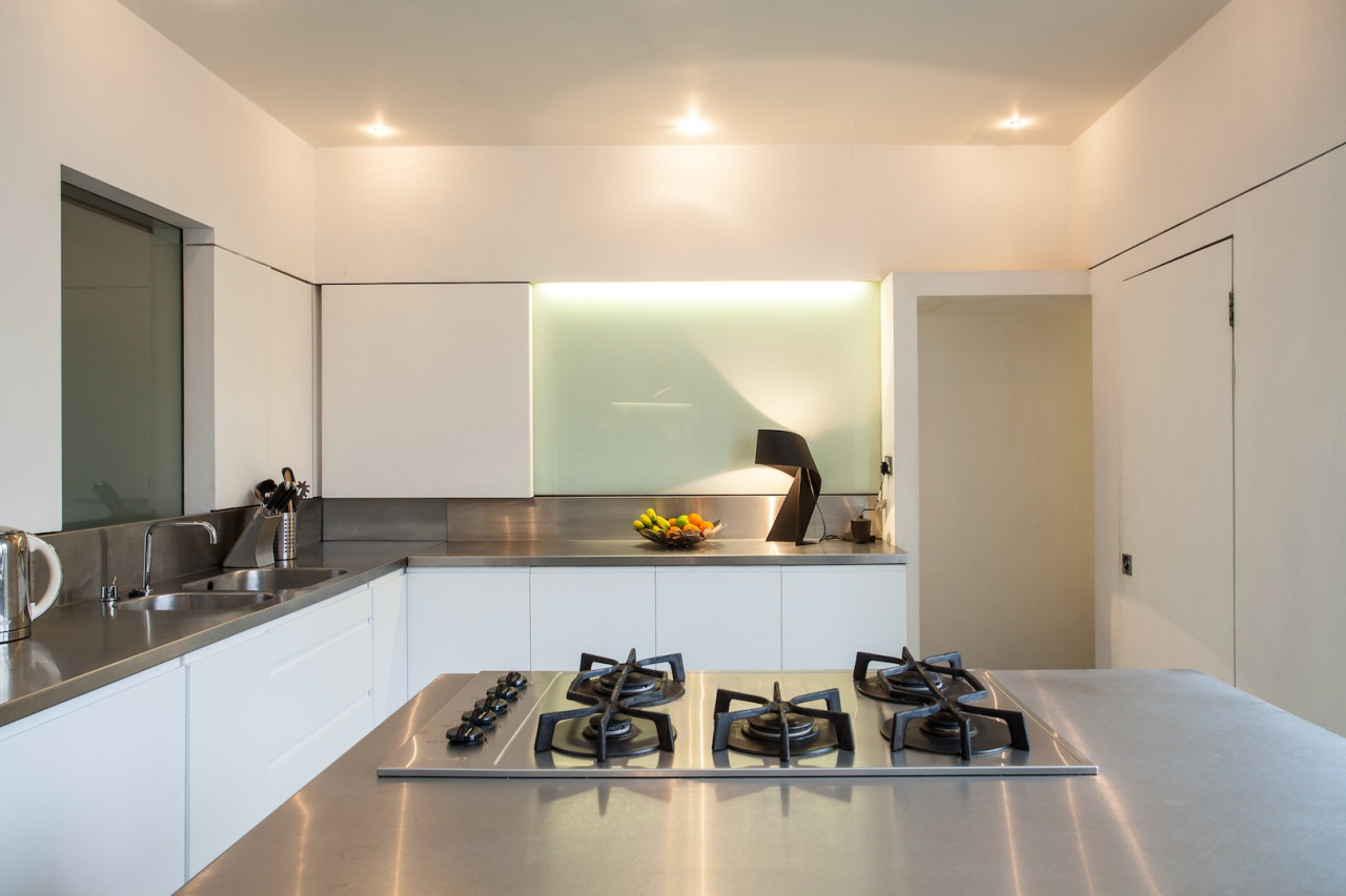
I’ve written about some striking apartments in Barcelona – Carrer Avinyó designed by David Kohn Architects is one of my favourites for its dramatic use of volume and sense of craftsmanship, not to mention those incredible floor tiles. And while this project by Mesura is very different to Carrer Avinyó in terms of aesthetics – where the latter was dramatic, this project is quiet and understated – they are linked by the beautiful use of materials.

Continue Reading…

Spaces

WESTER RIGGS

12th December 2014

“Even from outside, we loved it,” Lisa McMyn says as she recalls her first impression of this Victorian house in Lasswade in Midlothian, which she viewed with her husband Neil back in 2007. The couple were leaping in at the deep end when they bought this property. Lisa and Neil had been living in Sydney for five years, and they initially offered on the four bedroom house while still in Australia, having only seen photos. When they eventually travelled to Scotland to view Wester Riggs a month later they realised that the house required a lot more work than they’d anticipated. Continue Reading…

Spaces

ST PAULS MEWS

19th August 2014

Every so often I spot a property that, even though it’s under offer or, as in this case, has already sold, is so great looking that I need to feature it. Because for everyone’s that’s looking at property with the aim of buying a new house or flat, there are even more people looking purely for design inspiration. Continue Reading…

Spaces

ST BERNARD’S CRESCENT

11th June 2014

What happens when a property expert and an interior designer go shopping for a new home? Well, chances are, they find a great property in a prime location, and tackle a bit of a project. Do you know of any interior designers who wouldn’t want to transform their own home? No, me neither. Continue Reading…

Spaces

MARDALE CRESCENT

24th March 2014

Every so often – and rather frequently of late, it has to be said, as there are so many great looking properties coming onto the market – a new property arrives in my email inbox that stops me in my tracks. 10 Magdala Mews certainly did this a few weeks ago, as did interior designer Ian Smith’s flat in Belvedere Park, and it happened again last week with this striking looking five bedroom house at 16 Mardale Crescent, which is located just south of Edinburgh’s city centre.

With accommodation over three floors and gardens to the front and rear, this substantial family home balances its elegant period detailing and generous proportions with a contemporary interior style that comes into its own at the rear of the ground level, where the current owners have created a fabulous dining-kitchen space.

I wanted to focus on this dining-kitchen – as, after all, this can often be the space that sells a house. Here, the owner Susan describes the process of creating this great entertaining and family zone – and how this space has in turn transformed the house.

tumblr_n2wqx8DdNo1s1j1cto2_1280

What attracted you to this house, and what did it look like at the time?

It was the location. When I first moved to Edinburgh in the mid-80s I lived in Bruntsfield Gardens and the opportunity to live in Merchiston was too good to miss. This house was in pretty good condition; the previous owners were a lovely family but I wasn’t too keen on some of their colour schemes. The first thing we were going to do before our furniture arrived was to lift the carpets and strip and wax the flooring in the main rooms. However, when the carpets were taken up the original wood was found to be in perfect condition so that was a surprise find.

Were you looking for a project, and what was the potential you could see from this house?

Aside from completely redecorating my previous houses, we had remodelled kitchens and bathrooms before. This house was unusual as it was still in its original configuration – all four houses in the terrace were built as family houses and had obviously been cherished over the years. We didn’t want to interfere too much with that but it did need to be brought up to date. The kitchen and dining rooms were separate and that made for two awkward spaces, but we could see the potential of bringing them together to make a family space.

The kitchen had been fitted out (quite expensively, we discovered, as we found the receipt!) but in a very traditional finish that wasn’t to my taste. It was also a bit cluttered with a breakfast bar that took up too much of the floor space. And while it was lovely to have a formal dining room, it was quite small and a bit of a nuisance to have to carry food to and from the different rooms.

tumblr_n2wqx8DdNo1s1j1cto5_1280

At what stage did you decide to open up the kitchen and dining space at the rear of the ground floor?

We started thinking about the refurbishment work in the spring of 2009, with a plan to get the work started in the autumn. By then we had lived in the house for over a year and had a good feel for how the house worked. It is deceptively spacious – as it’s on a crescent the house fans out so that the rear is wider than the front. Because of this, by taking down the wall between the kitchen and dining rooms, as well as opening up the whole of the back wall, we gained a huge space with direct access into the garden. In effect this space becomes an outdoor room.

How did you go about the work to transform this area?

The work started that October with the removal of the walls and the installation of the beams. The stonework from the windows was retained and these now form a low wall between the lawn and the edge of the decking area – it’s nice to have that connection with the original layout. The cornicing in the dining room was also retained. Unfortunately the fireplace couldn’t be saved but all the other rooms in the house have their original fireplaces, including those on the top floor, which is unusual for a house of this age.

tumblr_n2wqx8DdNo1s1j1cto3_1280

Removing the old units opened up an area at the back of the kitchen where the old range would have been, and this added at least a metre to the depth of the kitchen. This allowed hidden cupboards to be installed – including a huge pull-out cupboard where I can fit all the crockery – so there’s no need for wall units and the whole kitchen looks clean and uncluttered.

This extra space also allowed for the opening that leads up to the study/gym (above the utility room) to be formed in a simple way, so that it’s in keeping with the rest of the space. It’s lovely and private up there so I can work (or work out) away from the hubbub of the house but I’m still just a shout away if needed.

How did you go about the design of the kitchen, and what made you choose the materials you’ve used here?

We went with very plain white cupboards and stainless steel for practicality (it’s all just wipe clean) and also because it’s so light and uncluttered. The door into the kitchen is the original door – the frosted panel behind the kitchen sink is where the kitchen door used to be, so that also allows light to pass between the hall and the kitchen and dining room.

The island unit has the hob, oven and fridge, plus a seating unit which is a great spot for the kids to sit while I’m cooking. This island really is the favourite place to gather. The layout also makes this space a wonderful spot for parties – even in winter the door can be opened up so that the whole space can be used. I love the decking; in the summer we eat out there as the deck gets the sun through the afternoon and evening and it’s very private.

tumblr_n2wqx8DdNo1s1j1cto1_1280

How has this dining-kitchen space changed the way the house feels or functions?

It’s the centre of the house; it’s where we have Christmas dinner, birthday parties, summer BBQs, do homework, watch telly – everything. But the rest of the house is also lovely. Each of the staircases has a cupola above, so these areas are flooded with light all year round and not just when the weather is good. The sitting room is also a family space and in winter we close the shutters, put on the fire and curl up and watch rubbish on telly.

The top floor feels like a separate zone, which is brilliant for the children. I had a shower put in the top floor bathroom a couple of years ago, and when we took out the bath I found a handwritten note from the first owner of the house, introducing himself to whoever found it. It was over a hundred years old and had been under there all that time.

Then when the third bedroom was being decorated we found portraits that had drawn on to the plaster. It included a drawing of a particularly stern looking woman in a cap, who I think must have been the lady of the house, and possibly the wife of the man that left the note. I know that the house now looks modern, but I love those connections back to its past.

tumblr_n2wqx8DdNo1s1j1cto6_1280

What’s been the best thing about living here?

We have loved living here; there’s a wonderful community atmosphere and it feels more like living in a village with all the benefits of town. The house is huge, bright and feels like home. I know that we’ll miss it but our new house will have a very similar layout, so I’m hoping that we’ll be as happy there as we have been here at Mardale.

Mardale Crescent as marketed by Strutt & Parker.

Spaces

AT HOME WITH THE BAILEYS

19th March 2014

It requires a confident eye to take a period house and carefully peel back the layers to reveal its age and inherent character. Often – typically – when we talk about refurbishments, it’s about taking an old house and sharpening it up, making the interior fresh and crisp and new again, and that’s an approach I’ve written about at length here. Indeed some of my favourite posts on The Property Files so far have embraced this old-new contrast – Kirk House in Ross-shire springs to mind as a prime example.

But there is another way, as Mark and Sally Bailey have demonstrated in their beautifully atmospheric Grade II* listed house located in the heart of the village of Clyro, near Hay-on-Wye and close to the English/Welsh border. Continue Reading…