I was speaking to a friend on Steller about the colour yellow, and how there are some colours that you just don’t ‘get’. I get grey; I could live with grey all the time and never grow tired. I love burnt orange and am increasingly drawn to rich, inky blues. But yellow? If I’m honest, it’s just not a colour I like.
Or is it? Because recently I’ve found myself admiring all sorts of things in the deeper yellow colour spectrum. A few months ago I visited some friends who had picked up an original Hans Wegner Papa Bear chair in Indian Yellow, which they had intended to reupholster in a less vibrant hue, only when they got it home they realised that it looked pretty great as it was.
Then last week I posted about this cool renovated apartment at Langham House Close, which features a vibrant yellow kitchen. I’d never even think about choosing a yellow kitchen, yet this hue worked so well in the context of this beautifully styled midcentury apartment.
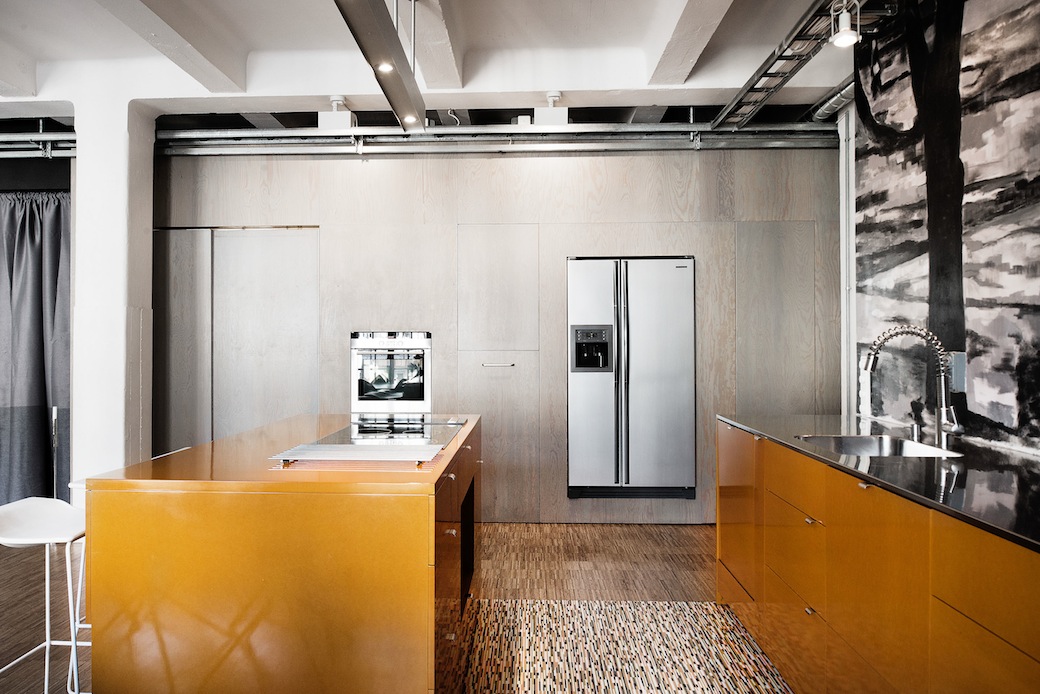
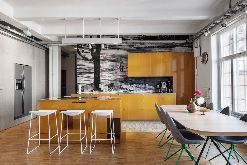
Which brings me to this apartment in Stockholm, which is on the market with Per Jansson. It goes without saying perhaps but this kitchen with its glossy lacquer marigold-hued cabinetry caught my eye. As with Langham House Close, it’s all about context. Again, the space itself is interesting. This three bedroom apartment sits within a converted factory building dating from 1900, and the volume of the spaces combined with the industrial styling have created a really vibrant home.
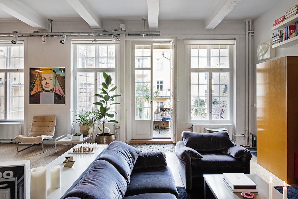
Central to this is the vast open plan living, dining and kitchen zone that’s bathed in light from the bank of tall windows, with French doors opening onto a balcony. Over the years, when I’ve interviewed people who have designed open plan living-dining-kitchen zones, they’ve often talked about wanting the kitchen to blend within the wider context, where the cooking zone didn’t have too much impact visually on the overall living space.
And I can appreciate all the reasons why this works in creating a cohesive space, yet one of my favourite ever open plan living-dining-kitchens was in a Georgian flat in Edinburgh with a minimal matt-finish orange kitchen set against dark grey walls. And I think this apartment, albeit different in period and palette and style, reminds me a little of that interior. Contrasting kitchens really can work, especially when the bold hue is carried into the space as a subtle accent, as seen here with the cabinetry on the right of the photo above and the contemporary artwork.
And this kitchen doesn’t just have a bold colour – just look at the mural splashback, which appears to be painted.
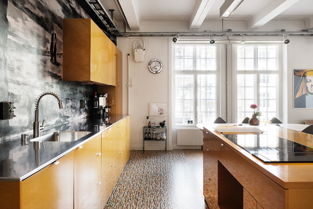
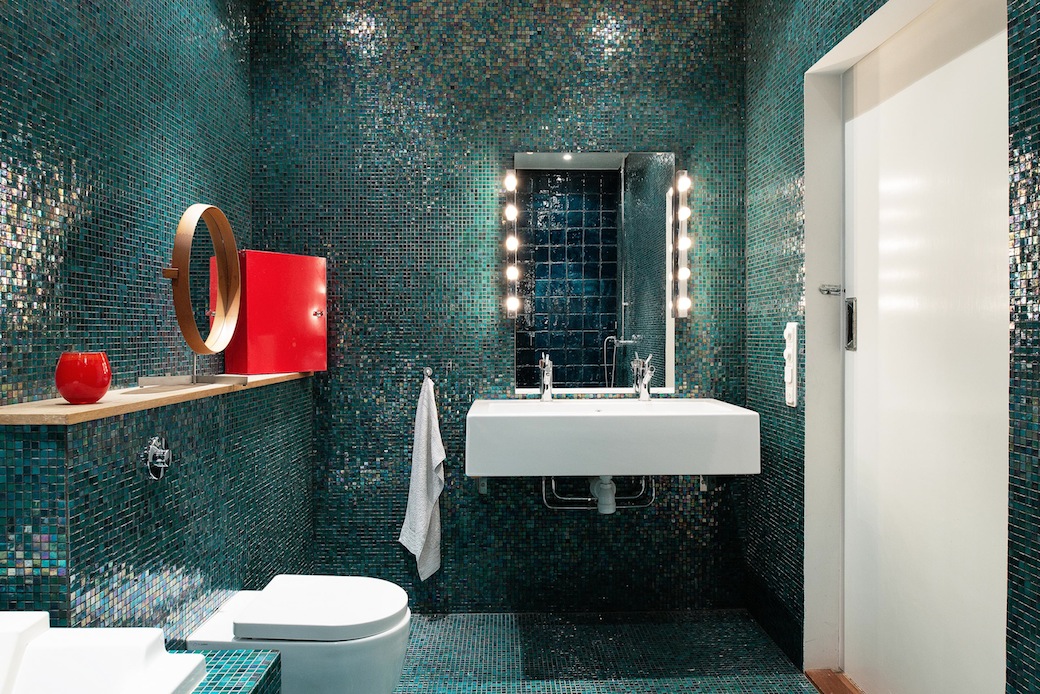
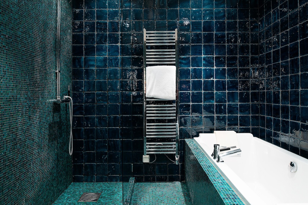
This may be a love-it-or-hate-it feature – indeed this might be a love-it-or-hate-it kitchen for some readers – but I love the individuality. And the rest of this apartment follows suit with unexpected hues and great styling details. Special mention goes to the bathroom with its iridescent mosaic tiling. Okay, personally, this is too much for me – maybe it’s an age thing but I need quiet, calm hues in a bathroom – but again it’s yet another feature that makes this apartment stand out from the crowd.
Upplandsgatan 17C is on the market with Per Jansson. Photography via Per Jansson.