I feel that I should start this post with a confession: I’ve been a big fan of Bold & Noble’s prints since the first time I spotted one a few years ago during an interiors shoot. A few clicks on the website later and Trees Around Britain was winging its way to my home. That was the beginning, and now, as I write this sitting at my desk, the British Isles Type Map is propped on the shelving unit opposite – at eye level so I can look up and have something engaging to gaze at while searching for the right words. The sharply graphic Stronger print is similarly propped on the mantelpiece in my office – in the Monochrome colourway, although I love the Canary Yellow too. These are pieces that I simply never tire of looking at.
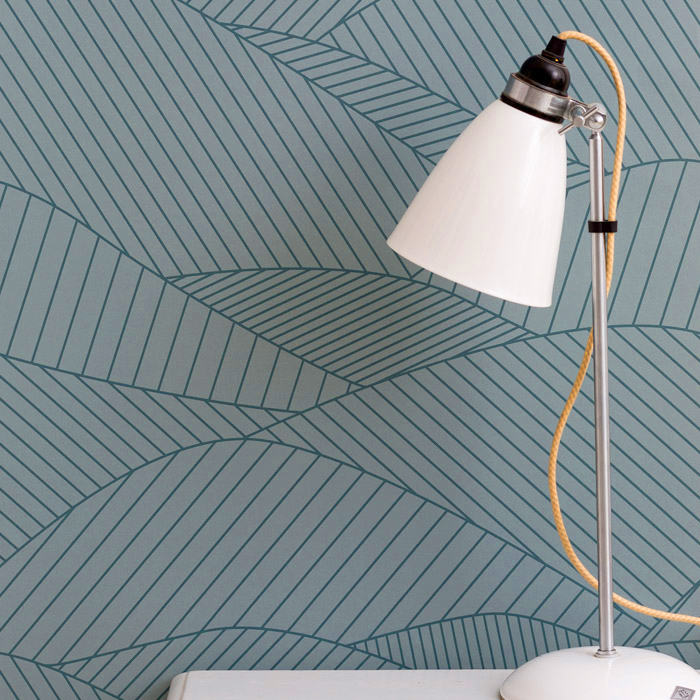
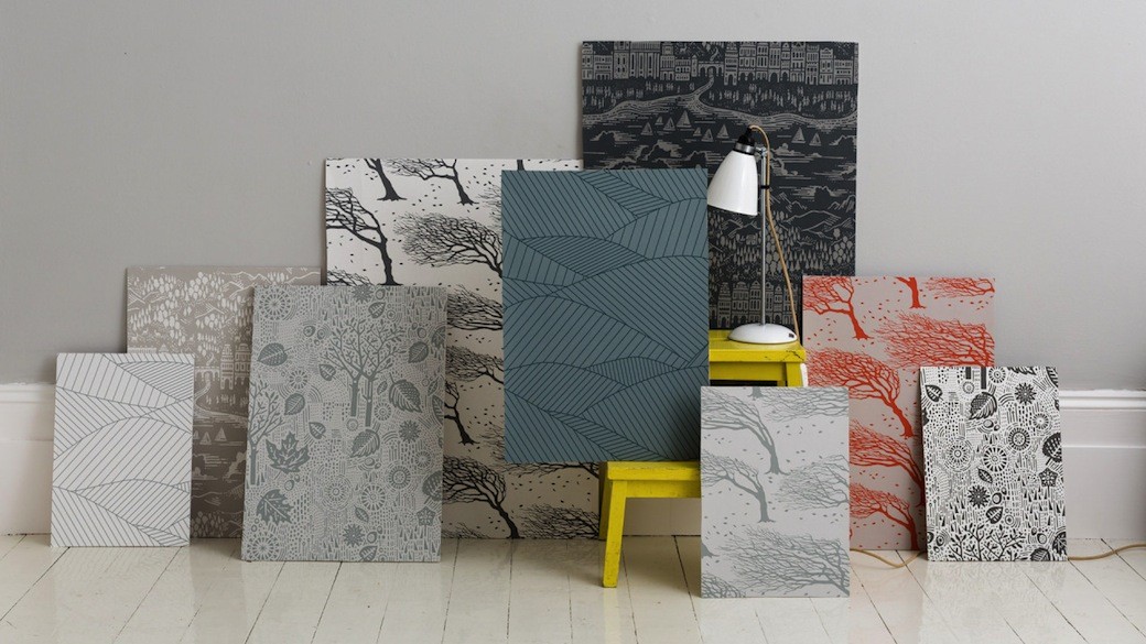
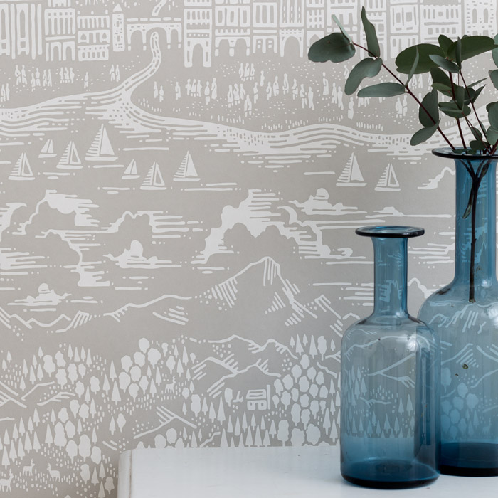
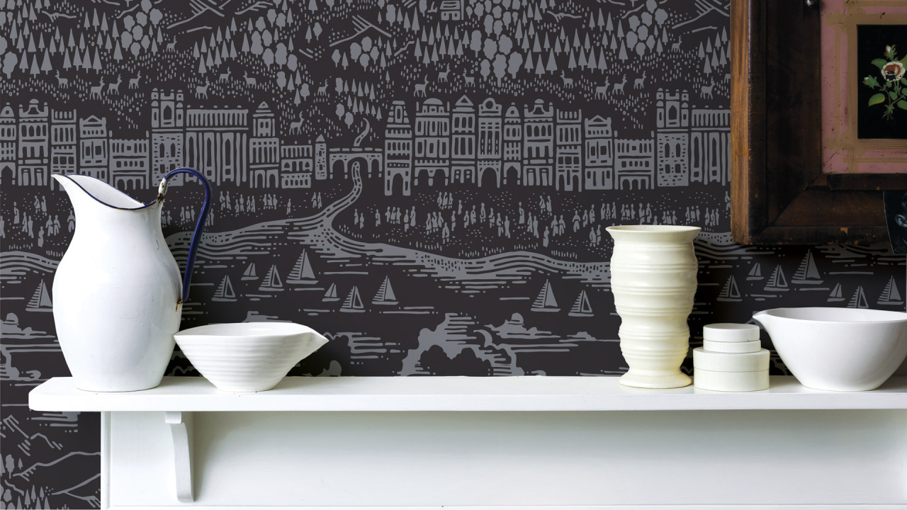
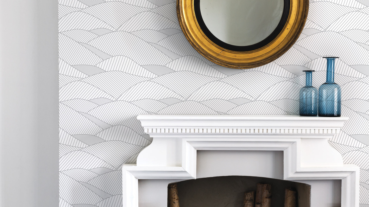
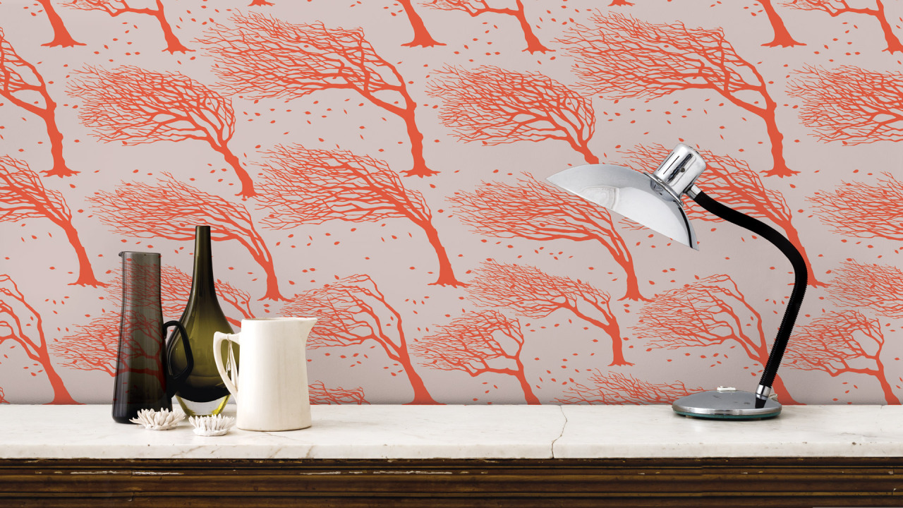
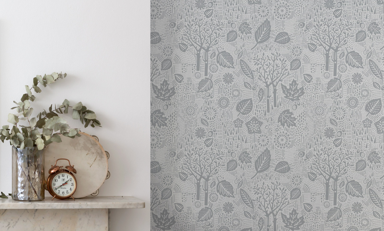
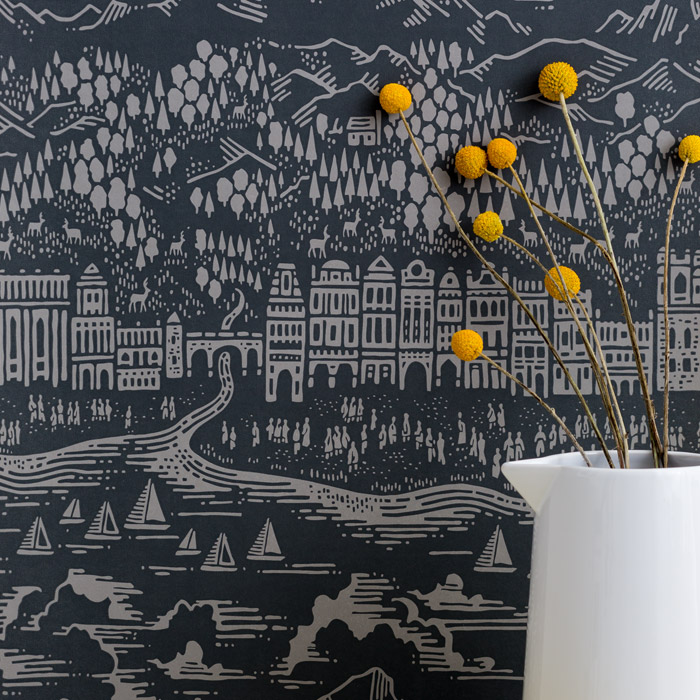
So imagine my excitement when I discovered that Bold & Noble were branching into wallpaper design. The Hertfordshire-based company – which is run by the creative partnership of Jane Tobitt and David Wardle – has launched four designs: Autumn, Northeasterly, Province and South Downs. Although a new direction for the company, this also feels like a natural evolution and each design has that distinct Bold & Noble style – not least in the colour palette, from the gorgeously subtle grey hues that run through the collection to the warm blaze of orange in the Sunrise colourway of the Northeasterly print, or the gentle blue-toned Sea Grey colourway in South Downs.
Here, creative director Jane Tobitt discusses the influences and design concepts that shaped this latest venture.
When did you start working on this new collection, and was it always part of the plan to develop your print range into wallpaper design?
We’ve been thinking about wallpaper for a couple of years. There were two strands to launching this new product range: sourcing a UK-based ecological manufacturer, so this took some time to research and plan, and then selecting the designs to produce.
Over the course of 2013 David and I created about forty wallpaper designs and tested them on our friends, family and design buddies. We discovered that people have very different tastes; the designs were well liked, but there wasn’t an out-and-out front runner. We managed to draw up a shortlist of ten designs to develop, but narrowing that down to the final four for production was very tricky.
We had no prior wallpaper experience so it was a bit of a stab in the dark. So far we’ve had some great feedback across the board though, so with a bit of luck we’re hoping our efforts will be worth it.
We also linked up with a Lancashire-based wallpaper mill; they’re one of only four surviving wallpaper printers left in the country. They also place a lot of emphasis on being environmentally conscious, so were a good fit for our company’s ethos.
Where did you take your inspiration from when designing the collection?
There is usually a ‘nature and the great outdoors’ theme to what we do. For such a large scale project we also visited the V&A print archives and researched how wallpapers had evolved through the ages. As a designer you’re aware of the rich art and design heritage in this country, so that forms a great backdrop to work against.
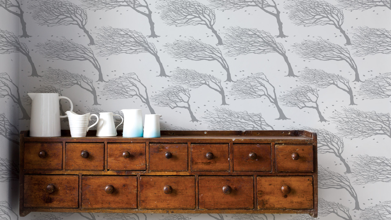
The Northeasterly and South Downs wallpaper designs were inspired by walking on the Seven Sisters in Sussex as a child. The extreme windswept trees on the coast imprint such a striking graphic image that we’ve finally been able to use in our work. Also the soft curves of the South Downs (Eric Ravilious country) has always inspired me. I’ve been thinking for a while about how we could create an artwork based on the rolling hills, but this idea lent itself to the continuum of wallpaper beautifully.
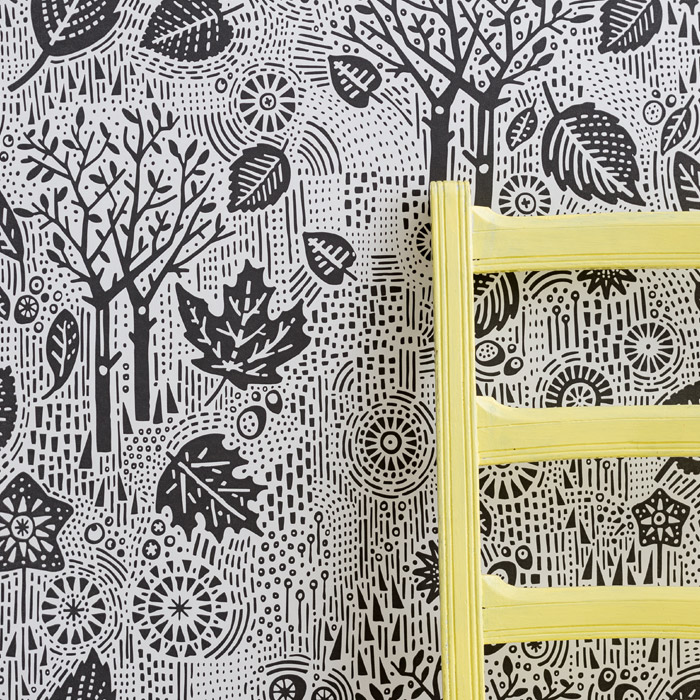
Province and Autumn have a Scandinavian, folky edge. They’re more illustrative and whimsical with their woodblock feel. Because we were testing the water with our designs, we wanted a good mix of styles so we could gauge how the public reacted to each design.
How did you decide on the colour palette?
We spent three days in Lancashire sampling and trying out various colour combinations. Neutral is always a safe bet as we’ve discovered with our prints and we had some great input from our printers and their experience in the market. I really wanted to produce the Sunrise colour for the Northeasterly design; it’s quite a bright one, but I felt we needed to be a bit daring. Quite often the press will like the more unusual colour combinations, but the wider public tend to prefer the neutral shades for their homes, so it was just about getting the balance.
Are there challenges specific to creating a wallpaper collection rather than the prints we know Bold & Noble for?
Yes, firstly it’s a new area that requires a good chunk of financial outlay, so we’re taking a calculated risk, whereas with the prints we had more involvement in the production and could do things on a smaller scale to start with. Also, storage: we currently have 144 boxes of wallpaper in our studio, so it’s a real challenge to accommodate that, along with the boxes and other packing materials required to transport it.
Do you have a favourite design from the collection?
Not really. Personally I love David’s designs because I couldn’t have created them, but the Northeasterly and South Downs designs also have a special resonance too because they’re inspired by my childhood and feel so nostalgic.
Do you plan to extend the range over time? What’s next from Bold & Noble?
Our plans for 2014 are to take it easy. We have a young family and last year struggled with the work/life balance while we were getting the wallpapers off the ground. We have some exciting new prints and tea towels in the pipeline for 2014, and then we’ll take stock of how our first collection of wallpaper went at the end of the year. If it’s been a success, we’ll no doubt create another collection and perhaps increase the colour range within the existing designs. It’s just a case of suck it and see. I think that’s what I find so exciting about our business: it’s out of our hands, it’s for the public to decide.
You can view the wallpaper collection online from Bold & Noble.